Difference between revisions of "Reset button"
m |
m (updated with dropdown list feature) |
||
| (2 intermediate revisions by the same user not shown) | |||
| Line 1: | Line 1: | ||
The reset button component resets any slider and | The reset button component resets any [[slider]], [[basic toggle]], [[advance toggle]], [[increment button]], and [[Dropdown List|dropdown list]] components on the page to their initial values, and is an extension of the ImpVis [[button]] component. | ||
Also see [[basic toggle]]'s resetCapability prop, for details on how to use the reset functionality in the form of a toggle instead. | |||
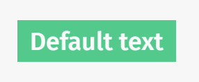
[[File:Button.png|thumb|The iv-reset-button component when active.]] | [[File:Button.png|thumb|The iv-reset-button component when active.]] | ||
==Technical information== | ==Technical information== | ||
The <code>iv-reset-button</code> is for use as a button which resets any | The <code>iv-reset-button</code> is for use as a button which resets any [[slider]], [[basic toggle]], [[advance toggle]], [[increment button]], and [[Dropdown List|dropdown list]] components on the page. It can also be used to execute any other function like a normal button would. To add text, simply write it in the iv-button slot (between the starting and closing HTML tags). | ||
===Props=== | ===Props=== | ||
Latest revision as of 10:09, 19 July 2021
The reset button component resets any slider, basic toggle, advance toggle, increment button, and dropdown list components on the page to their initial values, and is an extension of the ImpVis button component.
Also see basic toggle's resetCapability prop, for details on how to use the reset functionality in the form of a toggle instead.
Technical information
The iv-reset-button is for use as a button which resets any slider, basic toggle, advance toggle, increment button, and dropdown list components on the page. It can also be used to execute any other function like a normal button would. To add text, simply write it in the iv-button slot (between the starting and closing HTML tags).
Props
disabled
Type: Boolean
Required: false
Default: false
Description: When true the button is greyed out.
Events
mouseover
Trigger: mouseover
Description: Simple event carrying mouse event information, emitted when mouse cursor moves over button.
mouseleave
Trigger: mouseleave
Description: Simple event carrying mouse event information, emitted when mouse cursor leaves button.
click
Trigger: click
Description: Event resetting sliders and toggles on the page to their default values, as well as carrying mouse event information, emitted when mouse button pressed over button.
Design Choices
The green button is chosen to stand out against the general ImpVis blue. The lighter green upon cursor hovering gives the impression of active to tell the user the cursor is hovering over this option.

