Button
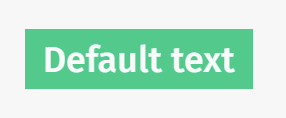
The button component is just a simple button which is designed to fit the ImpVis Theme and emit events which are easy to use.
Technical information
The iv-button is for use as a simple button, e.g. "play/pause"/"reset" etc. To add text, simply write it in the iv-button slot (between the starting and closing HTML tags).
Props
disabled
Type: Boolean
Required: false
Default: false
Description: When true the button is greyed out.
Events
mouseover
Trigger: mouseover
Description: Simple event carrying mouse event information, emitted when mouse cursor moves over button.
mouseleave
Trigger: mouseleave
Description: Simple event carrying mouse event information, emitted when mouse cursor leaves button.
click
Trigger: click
Description: Simple event carrying mouse event information, emitted when mouse button pressed over button.
Design Choices
The green button is chosen to stand out against the general ImpVis blue. The lighter green upon cursor hovering gives the impression of active to tell the user the cursor is hovering over this option.

