Dropdown List
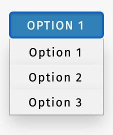
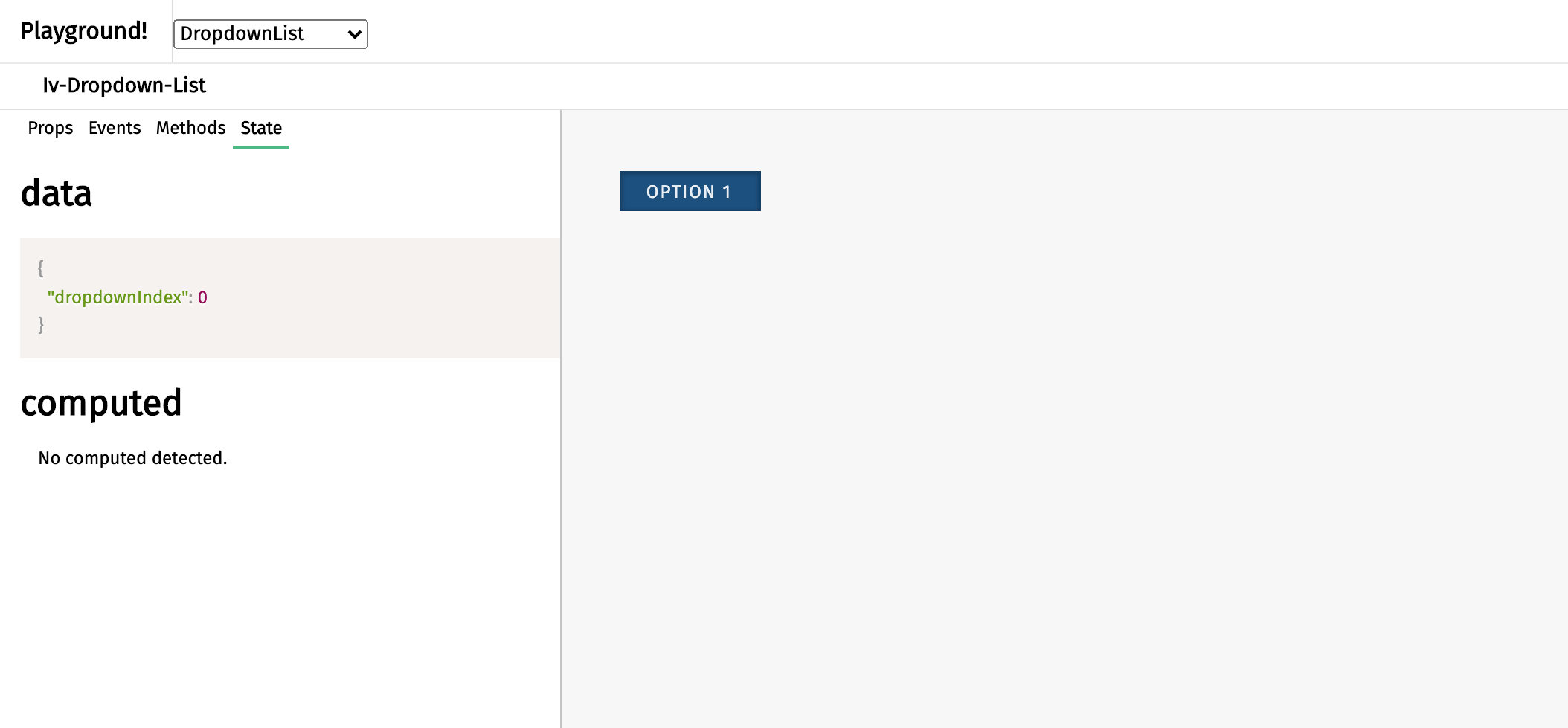
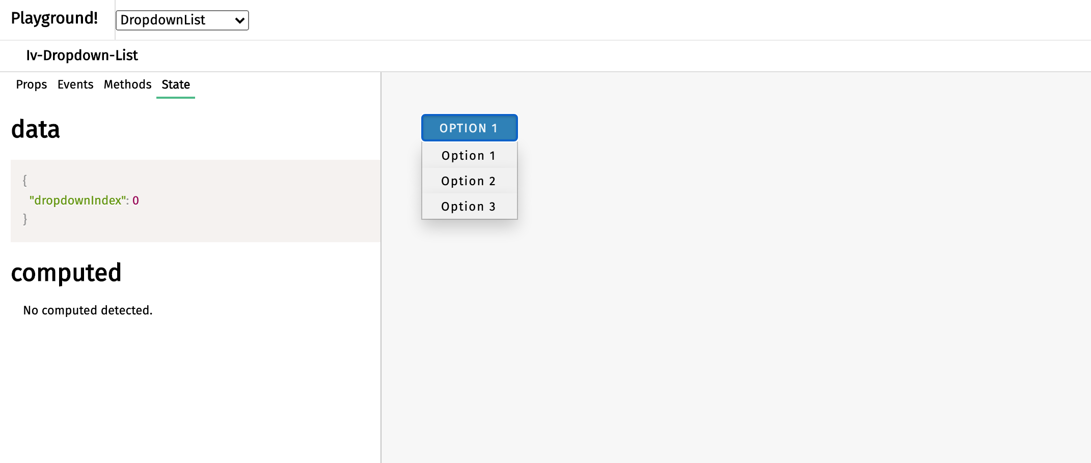
The dropdown list component appears as a button with a tray of options that becomes available or unavailable upon clicking. It serves as a way to hide multiple options for saving space. This component can be called using the iv-dropdown-list tag.
Technical information
The iv-dropdown-list is a button allows users to select a mode from a display/hide list of modes.
It is possible to disable the dropdown. This component builds on Dropdown List Element.
Props
Name: dropdownItems
Type: Array
Required: true
Default: ["Option 1", "Option 2", "Option 3"]
Description: The array container for the dropdown list text
Name: initialDropdownIndex
Type: Number
Default: 0
Description: Setting the initial dropdown mode
Name: dropdownDisabled
Type: Boolean
Default: false
Description: Disable the dropdown button
Events
Name: dropdownbuttonclicked
Description: Emitted when the dropdown button is clicked
Value: dropdownIndex
Name: dropdownelementclicked
Description: Emitted when the list element is clicked
Value: click event
Usage
To set the text for the options, create a prop with an array of the strings and bind the prop to modes. To disable the dropdown, set the dropdownDisabled prop as 'true'.
Design choice
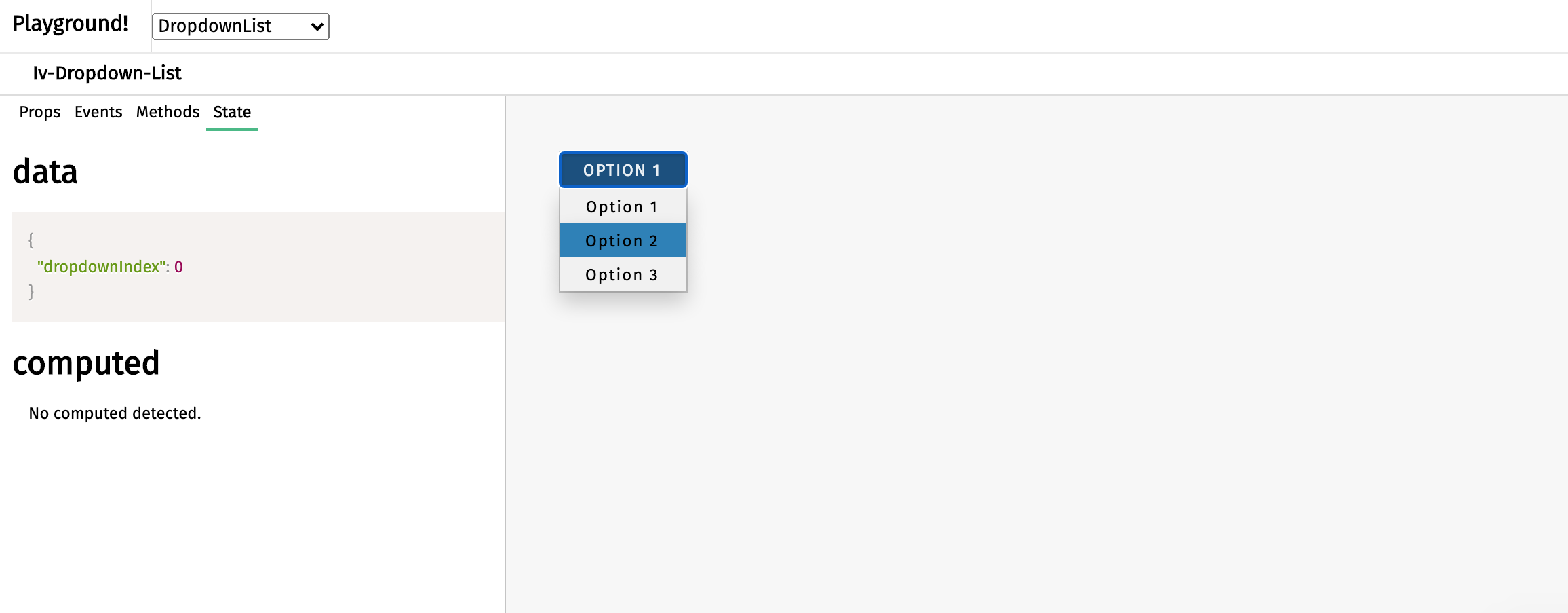
The blue button is chosen to fit in the general ImpVis blue. The lighter blue on the option upon cursor hovering gives the impression of active to tell the user the cursor is hovering over this option.


