Quantitative PCR
Contributors
Students
- Jaroslaw Ciba, Department of Physics, creates visual designs
- Thomas Travis, Department of Physics, oversees interactive aspects of design
- Marcus Essam, Department of Medicine, in charge of overall design
- Jacky Zhu, Department of Medicine, edits and updates wiki page
Staff Partners
- Anabel Varela Carver, Department of Surgery & Cancer. Staff partner from October 2021.
- Joana Dos Santos, Department of Surgery & Cancer. Staff partner from October 2021.
- Jon Krell, Department of Surgery & Cancer. Staff partner from October 2021.
- Robert Kypta, Department of Surgery & Cancer. Staff partner from October 2021.
Aims & Learning Outcomes
Intended Use and Audience
This visualization is intended for self-study to support iBSc Cancer Frontiers Module 1 teaching (q-PCR principles, data analysis and application to an experiment involving cancer cells)
Topic Background
qPCR is a laboratory technique widely employed in life science related subjects. It is build upon the foundation of PCR, a technological innovation allowing exponential amplification of genetic material. qPCR (Quantifying PCR) builds directly upon this concept, while enabling researchers to monitor the quantity of genetic material in real time as they amplify, hence the name qPCR or real-time qPCR. Through the analysis of data generated by qPCR, researchers will be able to conclude the presence or absence of a gene inside samples, as well as comparing their amounts in relative terms. Its most recent usage that gained global attention was its contributions to combating COVID-19 through viral DNA testing, which is considered the most accurate test to discover a current infection even in asymptomatic individuals.
Intended Learning Outcome
After using this visualization, students should be able to explain how changes in Ct values from a q-PCR experiment relate to changes in the numbers of copies of a gene that a cell contains (for example, a cancer cell upon treatment with a drug).
Design Overview
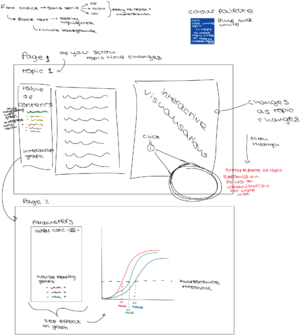
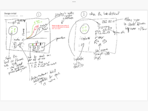
The overall flow of the visualization are divided into two parts:
- Explanation of the basic principles of PCR, including necessary reagents and what happens within one thermal cycle.
- Explanation of how to interpret PCR results (CT value in particular), as well as what factors may influence the result.
Each of these parts will be explored with multiple slides aiming to introduce material to students in manageable bits. For instance, PCR principles will be dissected down into lab flow, protocols, reagents, etc., whereas PCR results will be explored by taking apart separate data for examination first before bringing them together to form the bigger picture.
- Do not include justification or design progression, leave this for later sections.
Design Justification
Assessment Criteria
Education Design
- Target audience and their prior knowledge is clearly identified. This information is applied to decide what the learning outcomes should be.
- Key concepts identified and broken down into several discrete and easily achievable points.
Graphical Design
- The design is such that the visualization is clear and easily understood; the layout isn't cluttered.
- The choice of font, as well as size and placement of text, makes the information easy to comprehend.
- The color palette is appropriate and well justified, making it easy to see all text/design elements
Interaction Design
- The learner should know intuitively what the objectives are of the visualization.
- The user should be able to intuitively understand the function of each interactive element in the visualization.
- There should be immediate visual feedback when a learner interacts with the visualization.
Education Design
- What Methods were considered to convey concepts?
- Design progression, key choices with justifications.
- How has feedback been incorporated.
Graphical Design
- How were accessibility issues considered?
- How was space used effectively?
- Design progression, key choices with justifications.
- How has feedback been incorporated.
- How is the design intuitive?
Interaction Design
- Choice of interactive element(s) that fit in organically with the visualisation [inspiration of choice might be from lecture/in-class activity or other sources] - Sliders/Buttons/Cursor (hover/click).
- Keeping accessibility of interactive elements in mind during design phase.
- Design progression, key choices with justifications.
- How has feedback been incorporated.
Progress and Future Work
- Is the design finalised?
- Which pages have been uploaded to website?
- Any ideas for future improvements.
Links
- Link to GitHub repository for code in development:
- Link to visualisation on ImpVis website (when uploaded):
- Link to Collection on ImpVis website (when created):
- https://miro.com/app/board/o9J_lpvA2AE=/?invite_link_id=762082753954

