Loading Bar
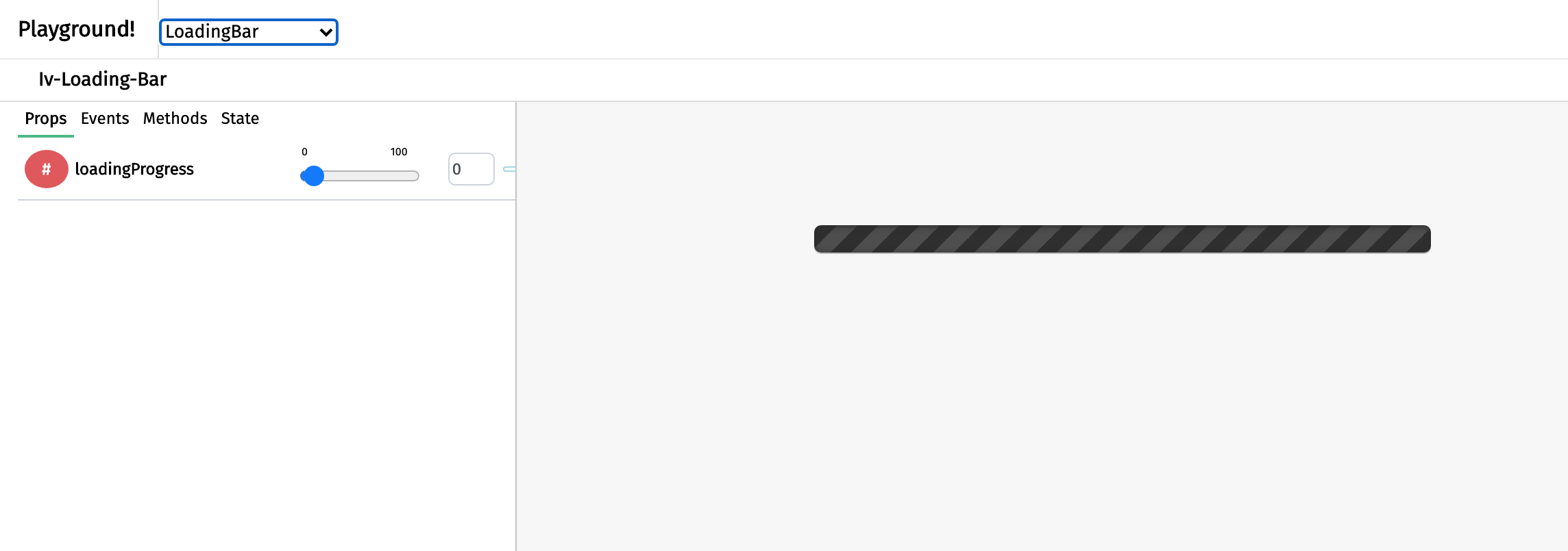
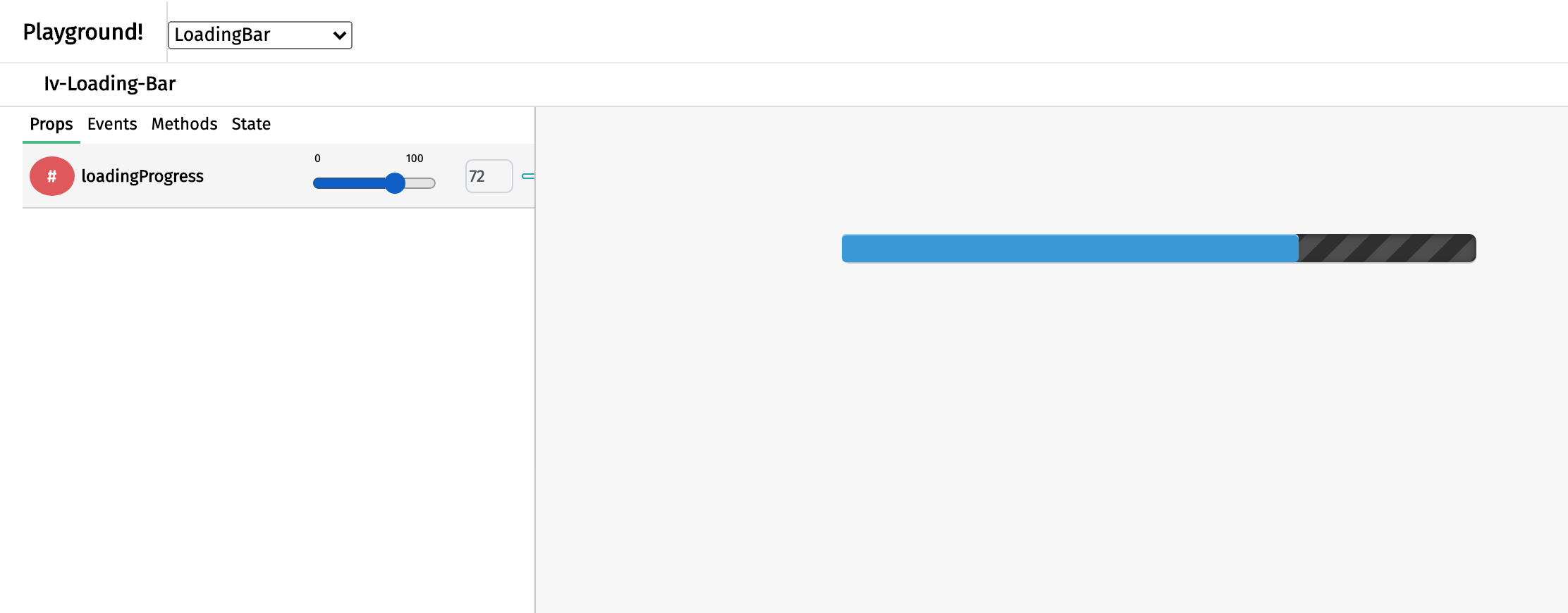
The loading bar component appears as a grey rectangle that fills up and serves to display the loading progress of a visualisation. It is particularly useful when a long loading time is inevitable as it assures the user that loading is happening. The benefit of this component over the loading spinner component is this component allows the user to anticipate the loading time. This component can be called using the iv-loading-bar tag.
Technical information
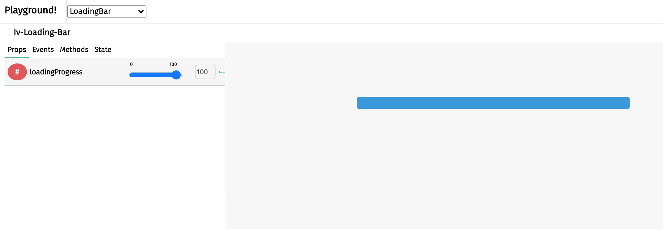
The iv-loading-bar is a non-reactive that takes in a number and display the number through its percentage width.
Props
Name: loadingProgress
Type: Number
Default: 0
Description: The number that is taken in and turned into percentage width of the blue progress bar.
Usage
To display the loading progress of a visualisation, bind a number, which must have a range of only 0 to 100, that reflects the loading.
Design choice
The blue progress bar is chosen to fit in the general ImpVis blue while the grey background gives a sense of incomplete or inactive.


