Heat Transport Visualisation
Jump to navigation
Jump to search
Author - Helen
Summary
Redesigning an existing visualisation, to make it better
Visualisation Topic Title:
- Investigating how the temperature profile varies within a composite wall under 1D steady-state conduction.
Intended Learning Outcomes (ILOs):
- After using the visualisation, the student should be able to:
- Visualise how the temperature profile varies within a composite wall under 1D steady-state conduction as the following parameters are changed:
- Wall thickness
- Wall subject to uniform heat generation
- Surface temperature of each wall material
- Wall material
- Understand that the temperature profile within a planar wall is linear (under 1D steady-state conduction, no heat generation)
- Understand that the temperature profile at and away from the wall is an exponential, as explained by Newton's Law of Cooling
- Visualise how the temperature profile varies within a composite wall under 1D steady-state conduction as the following parameters are changed:
Motivation:
- The idea for this visualisation came after I had struggled to visualise a concept within my ‘Heat and Mass Transport 2’ module in the 2nd year of my degree (MEng Biomedical Engineering).
- I had found an existing visualisation online, by WOLFRAM: WOLFRAM Visualisation, but it had many limitations in its functionality. I therefore decided that I would redesign and improve it.
Intended User:
- 2nd year MEng Biomedical Engineering students, studying the module: BIOE50001
Mode of Learning:
- Independent study, study groups
Initial Visualisation Idea:
- The original plan for the example project was to code the visualisation in JavaScript, from the perspective of someone who had never used JavaScript before and only had two years of Python experience.
- I had intended to redesign the existing visualisation with more useful ILOs, and code this design on the ImpVis template using JavaScript.
Detailed Achievements
Design Process
Ideas Brainstorming
- First, I worked with Dalia, using Miro to identify what needed to be improved and worked on in the new design, by brainstorming ideas for improved features.
Output

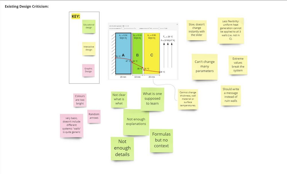
Screenshot of WOLFRAM visualisation with sticky notes for ideas for graphic, interactive and educational design improvements
The original Miro board, from which this screenshot was taken can be found here
Visualisation Resource
- I then designed and created a resource on the topic in order to show it to Dalia, who had less prior knowledge on the subject.
Output
The link to the resource's pdf can be found here - (link accessible to Imperial students only).
- While creating this resource I identified the following benefits:
- Designing the ILOs for my visualisation was much easier.
- I was able to revise my design ideas, after thoroughly reviewing the background topic.
Visualisation Design
Desmos Visualisation
- Despite my initial plans to code the visualisation from scratch, I decided to create a non-coded visualisation using Desmos Graphing Calculator.
- I chose this because:
- It was more efficient to use in the time frame I had (2 weeks)
- I wanted the visualisation to be as easy to use as possible without detracting from the ILOs
Output
- My final visualisation is made up of three designs, each one more complex than the one before it.
Design 1

Access Design 1 here
Design 2

Access Design 2 here
Design 3

Access Design 3 here
- To compare the resource and visualisation design, go to this Miro board here.
Integration of Visualisation onto ImpVis template

- We decided to integrate the visualisation onto the ImpVis template, which was done by Abhinand (don't have link).
Learning
- While working on my visualisation, I realised how important it is to document your progress as you go along and to be able to adapt your ideas if your original plan doesn't work out. After initially deciding to code up the visualisation, I switched to using Desmos.
- When creating a visualisation, I also learned the value of collaboration. Collaboration with other group members aided in the development and progression of my own visualisation.
What I didn't do
- I didn't do the following tasks, due to lack of time:
- Finish all the designs for my visualisation, including adding a scene on heat generation in the wall.
- Compare my current visualisation to the existing WOLFRAM visualisation.
- Document my progress and journey while creating the visualisation.
- Test whether my visualisation met the ILOs.
- Fully integrate the visualisation into the ImpVis Wiki- including adding calculations and descriptions.
- In retrospect, I would have created a mockup of my visualisation in Figma, and then made any adjustments to my design, before creating it in Desmos.
Next Step
For future improvements to my visualisation I would like to do the following:
- Fully integrate the visualisation onto the ImpVis template, so that it can be used by others; this should be done after all designs are completed and after any potential errors have been identified.
- Code up the visualisation with JavaScript and compare this to the Desmos version.
- Test the visualisation with my intended target users, and make any changes based on their feedback.
- Directly integrate the visualisation into the ImpVis Wiki, if a working visualisation is achieved.