Difference between revisions of "Quantitative PCR"
JaroslawCiba (talk | contribs) (Education and Design Justifications Done) |
|||
| (2 intermediate revisions by one other user not shown) | |||
| Line 1: | Line 1: | ||
==Contributors== | ==Contributors== | ||
'''Students''' | '''Students''' | ||
| Line 16: | Line 15: | ||
This visualization is intended for self-study to support iBSc Cancer Frontiers Module 1 teaching (q-PCR principles, data analysis and application to an experiment involving cancer cells) | This visualization is intended for self-study to support iBSc Cancer Frontiers Module 1 teaching (q-PCR principles, data analysis and application to an experiment involving cancer cells) | ||
Learners are expected to have an basic understanding of how PCR functions as well as the purposes of using this technology, which are part of the standard A-level Biology curriculum. | Learners are expected to have an basic understanding of how PCR functions as well as the purposes of using this technology, which are part of the standard A-level Biology curriculum. | ||
'''Topic Background''' | '''Topic Background''' | ||
| Line 25: | Line 24: | ||
After using this visualization, students should be able to explain how changes in Ct values from a q-PCR experiment relate to changes in the numbers of copies of a gene that a cell contains (for example, a cancer cell upon treatment with a drug). | After using this visualization, students should be able to explain how changes in Ct values from a q-PCR experiment relate to changes in the numbers of copies of a gene that a cell contains (for example, a cancer cell upon treatment with a drug). | ||
* Understand how PCR is applied to various biological research | * Understand how PCR is applied to various biological research | ||
* Describe the workflow of PCR centered protocols | * Describe the workflow of PCR centered protocols | ||
* Explain the roles of different reagents used in PCR | * Explain the roles of different reagents used in PCR | ||
* Provide basic analysis based on qPCR data, such as CT values | * Provide basic analysis based on qPCR data, such as CT values | ||
==Design Overview== | ==Design Overview== | ||
The overall flow of the visualization are divided into two parts: | The overall flow of the visualization are divided into two parts: | ||
# Explanation of the basic principles of PCR, including necessary reagents and what happens within one thermal cycle. | # Explanation of the basic principles of PCR, including necessary reagents and what happens within one thermal cycle. | ||
# Explanation of how to interpret PCR results (CT value in particular), as well as what factors may influence the result. | # Explanation of how to interpret PCR results (CT value in particular), as well as what factors may influence the result. | ||
Each of these parts will be explored with multiple slides aiming to introduce material to students in manageable bits. For instance, PCR principles will be dissected down into lab flow, protocols, reagents, etc., whereas PCR results will be explored by taking apart separate data for examination first before bringing them together to form the bigger picture. | Each of these parts will be explored with multiple slides aiming to introduce material to students in manageable bits. For instance, PCR principles will be dissected down into lab flow, protocols, reagents, etc., whereas PCR results will be explored by taking apart separate data for examination first before bringing them together to form the bigger picture. | ||
The entire project has been put together in a Powerpoint, available [https://imperiallondon-my.sharepoint.com/:p:/g/personal/jwc20_ic_ac_uk/EfWqmugEj01NlH_zrMdI9TgB94U2218wx4Q-P2nf1poV_Q?e=i9euEO&isSPOFile=1 here]. | |||
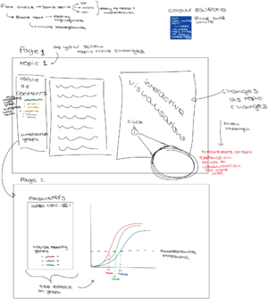
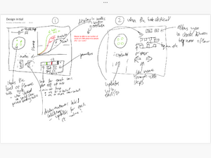
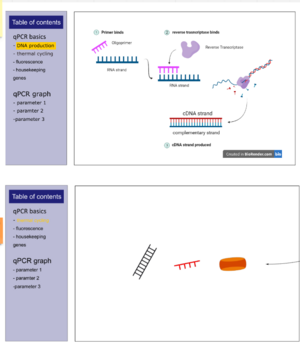
An example mockup animation, for PCR is available [https://imperiallondon-my.sharepoint.com/:p:/g/personal/jwc20_ic_ac_uk/EZAbz8uaTLxLtdJ3uAYK704BnMIbwp2jZ6ynFvNlL0tkQw?e=0v3Zgi here].[[File:PCR Slide 1.png|thumb|Original Design (1)]][[File:PCR Slide 2.png|thumb|Original Design (2)]][[File:Slide 1 2.png|thumb|First two slides of revised design]] | |||
==Design Justification== | ==Design Justification== | ||
===Assessment Criteria=== | ===Assessment Criteria=== | ||
| Line 52: | Line 43: | ||
#Key concepts identified and broken down into several discrete and easily achievable points. | #Key concepts identified and broken down into several discrete and easily achievable points. | ||
'''Graphical Design''' | '''Graphical Design''' | ||
# The design is such that the visualization is clear and easily understood; the layout isn't cluttered. | # The design is such that the visualization is clear and easily understood; the layout isn't cluttered. | ||
# The choice of font, as well as size and placement of text, makes the information easy to comprehend. | # The choice of font, as well as size and placement of text, makes the information easy to comprehend. | ||
# The color palette is appropriate and well justified, making it easy to see all text/design elements | # The color palette is appropriate and well justified, making it easy to see all text/design elements | ||
'''Interaction Design''' | '''Interaction Design''' | ||
# The learner should know intuitively what the objectives are of the visualization. | # The learner should know intuitively what the objectives are of the visualization. | ||
# The user should be able to intuitively understand the function of each interactive element in the visualization. | # The user should be able to intuitively understand the function of each interactive element in the visualization. | ||
# There should be immediate visual feedback when a learner interacts with the visualization. | # There should be immediate visual feedback when a learner interacts with the visualization. | ||
===Education Design=== | ===Education Design=== | ||
*Diagrams | *Diagrams are used throughout the visualisation as they convey a lot of information without requiring large blocks of text. Their use of colour can make them stand out too, allowing for a better overall learning experience for the learner. | ||
*At the end of each section, we want to include a question testing the learner's knowledge - a mastery learning approach. These are included for the finished sections of the design. They are short questions, as was agreed with our staff partners in discussion, as students at Imperial generally feedback they are not tested enough in the resources provided by the Medicine department. | |||
*At the end of each section, we want to include a question testing the learner's knowledge - a mastery learning approach. These are included for the finished sections of the design. They are short questions, as was agreed with our staff partners in discussion. | |||
*The visualisation uses a scaffolding approach, where concepts are built upon through the entire visualisation. We first cover PCR, the technique built upon by qPCR, followed by looking at specific qPCR methods. In the next section, the result of these procedures, a qPCR graph, is discussed in more detail. Its shape is first described in the basics section, followed by methods needed to analyse it. We then finally introduce the factors affecting the Ct value in the graph one by one, before giving the user full access to an interactive graph with all the introduced complexity available (control of starting amount and the effect of a drug). | *The visualisation uses a scaffolding approach, where concepts are built upon through the entire visualisation. We first cover PCR, the technique built upon by qPCR, followed by looking at specific qPCR methods. In the next section, the result of these procedures, a qPCR graph, is discussed in more detail. Its shape is first described in the basics section, followed by methods needed to analyse it. We then finally introduce the factors affecting the Ct value in the graph one by one, before giving the user full access to an interactive graph with all the introduced complexity available (control of starting amount and the effect of a drug). | ||
===Graphical Design=== | ===Graphical Design=== | ||
==== General ==== | |||
*Most spaces are filled with custom made diagrams with captions to explain the different elements involved. | *Most spaces are filled with custom made diagrams with captions to explain the different elements involved. | ||
*Diagrams are designed or borrowed from biorender.com | *Diagrams are designed or borrowed from biorender.com. | ||
*Pages have a side section explaining concepts in text and a graphical panel on the right. | *Pages have a side section explaining concepts in text and a graphical panel on the right. | ||
*Use of imperial colour scheme | *Use of [https://www.imperial.ac.uk/brand-style-guide/visual-identity/brand-colours/ Imperial colour scheme] throughout so visualisation clear to see. This is a colour blind friendly palette. | ||
==== PCR and qPCR Reagants ==== | ==== PCR and qPCR Reagants ==== | ||
===== ''DNA Strands'' ===== | ===== ''DNA Strands'' ===== | ||
* Chose a simple design made of straight lines. A lot of abstraction is allowed, as learners focus is on understanding PCR/qPCR - they already have brilliant grasps on the structure of DNA and other reagants, so do not need the detail. For example, the double helix of structure of DNA is simply reduced to straight lines with bases connecting them. Bases in uniform colour too - we do not need to match complementary bases, learners are more than aware of it. We instead use different colours to signfify areas of interest on the strands. | * Chose a simple design made of straight lines. A lot of abstraction is allowed, as learners focus is on understanding PCR/qPCR - they already have brilliant grasps on the structure of DNA and other reagants, so do not need the detail. For example, the double helix of structure of DNA is simply reduced to straight lines with bases connecting them. Bases in uniform colour too - we do not need to match complementary bases, learners are more than aware of it. We instead use different colours to signfify areas of interest on the strands. | ||
* Specifically, a simple green (#00FF00) was used to indicate area where the primer attaches, making it stand out. Later, this was changed to Imperials Teal for consistency with the Imperial palette and for contrast with SYBR green, reserving green for fluorescence. | * Specifically, a simple green (#00FF00) was used to indicate area where the primer attaches, making it stand out. Later, this was changed to Imperials Teal for consistency with the Imperial palette and for contrast with SYBR green, reserving green for fluorescence. | ||
| Line 84: | Line 69: | ||
* The thickness of strands was also played around with. Very thin and very thick designs both look awful, and a midrange thickness was chosen. | * The thickness of strands was also played around with. Very thin and very thick designs both look awful, and a midrange thickness was chosen. | ||
* Rounded caps are used at the ends of the strands as they do look better. | * Rounded caps are used at the ends of the strands as they do look better. | ||
===== ''Primers'' ===== | ===== ''Primers'' ===== | ||
* Settled on red for contrasting against the green of area of interest on DNA strands. | * Settled on red for contrasting against the green of area of interest on DNA strands. | ||
* Imperials Red used (#DD2501) in final design, for consistency with the Imperial palette. This still contrasts the teal areas of interest well. | * Imperials Red used (#DD2501) in final design, for consistency with the Imperial palette. This still contrasts the teal areas of interest well. | ||
===== ''Polymerase'' ===== | ===== ''Polymerase'' ===== | ||
* Polymerase simplified to a rounded rectangle, with two ellipses, similar to some designs in research. | * Polymerase simplified to a rounded rectangle, with two ellipses, similar to some designs in research. | ||
* The rectangle is orange from the imperial palette (#D24000), whilst the ellipses are tangerine (#EC7300). The darker colour is used to indicate depth, as the elliptical components of the polymerase "wrap" around a strand. | * The rectangle is orange from the imperial palette (#D24000), whilst the ellipses are tangerine (#EC7300). The darker colour is used to indicate depth, as the elliptical components of the polymerase "wrap" around a strand. | ||
===== ''Taqman Probe - Body'' ===== | ===== ''Taqman Probe - Body'' ===== | ||
* The body of the probe was made in a style consistent with previous visuals - sharp angles, no rounding, mostly straight lines. | * The body of the probe was made in a style consistent with previous visuals - sharp angles, no rounding, mostly straight lines. | ||
* Lemon yellow (#FFDD00) used for the body of the probe, from the Imperial palette. Differentiates the probe from other elements;different colour from thermal cycles elements. | * Lemon yellow (#FFDD00) used for the body of the probe, from the Imperial palette. Differentiates the probe from other elements;different colour from thermal cycles elements. | ||
[[File:VD2.png|thumb|Comparison of old and improved design.]] | [[File:VD2.png|thumb|Comparison of old and improved design.]] | ||
===== ''Taqman Probe - Quencher and Fluorescent Probe'' ===== | ===== ''Taqman Probe - Quencher and Fluorescent Probe'' ===== | ||
*The quencher is a completely passive element, so grey used to not stand out. Different greys from the Imperial palette looked at, and initially settled on dark grey (#373A36). Light grey a bit difficult to see against the white background, whilst dark grey simply stands out better than cool grey - however, when the probe was combined with a DNA strand, it looked better with cool grey. As a result, cool grey (#9D9D9D) used in final design. | *The quencher is a completely passive element, so grey used to not stand out. Different greys from the Imperial palette looked at, and initially settled on dark grey (#373A36). Light grey a bit difficult to see against the white background, whilst dark grey simply stands out better than cool grey - however, when the probe was combined with a DNA strand, it looked better with cool grey. As a result, cool grey (#9D9D9D) used in final design. | ||
*The fluorescent probe emits green light; Imperials dark green used to show that the probe is inactive. When probe is detached off taqman, fluorescene starts. The greens featured on the Imperial colour palette not deemed suitable. A more vibrant light green used (#66ff0a) after playing around with the colours. | *The fluorescent probe emits green light; Imperials dark green used to show that the probe is inactive. When probe is detached off taqman, fluorescene starts. The greens featured on the Imperial colour palette not deemed suitable. A more vibrant light green used (#66ff0a) after playing around with the colours. | ||
===== ''SYBR Green Design'' ===== | ===== ''SYBR Green Design'' ===== | ||
*An inactive and active version exist; when attached to dsDNA, the dye is active. Inactive otherwise. This is simply shown via colour change. | *An inactive and active version exist; when attached to dsDNA, the dye is active. Inactive otherwise. This is simply shown via colour change. | ||
| Line 113: | Line 89: | ||
===Interaction Design=== | ===Interaction Design=== | ||
*Our first design included a large text box section however with feedback and self reflection we realised this wouldn't be engaging for the user even though it would be an efficient way to display information in a small space | *Our first design included a large text box section however with feedback and self reflection we realised this wouldn't be engaging for the user even though it would be an efficient way to display information in a small space | ||
* | *The final page of the qPCR graph section will allow users to tweak a qPCR curve with PCR parameters to observe how it can affect experimental outcomes. | ||
* | *On the qPCR basics pages, the user can bring up more information by clicking the show more buttons. The extra information then will fade in, in place of the summary of the specific process. The user can then bring up another slide by clicking a different show more button, or go back to the summary by clicking the red cross. | ||
*On the qPCR basics pages, the learner can play an animated version of the specific step in the qPCR/PCR process. A full animation of the entire process was liked by our peers, but with the change of format between the first draft and the final draft design, this is not included. To compromise, we include smaller pieces, distributed to each process. | |||
*To navigate between the different visualisation pages, the user may scroll or directly click the relevant table of contents title. This flexibility is included as learners on revisits may not necessarilly require visiting all the sections, and may be more interested in a specific one or few. | |||
*Different approaches are used for variety in end of section questions. These include checkboxes for multiple choice questions, draggable boxes for the ordering question for PCR steps and fillable parts for the Delta-Delta method. Prompts included to make sure the learner knows what to do in each section. | |||
*All parts of visualisation include an ImpVis logo, permitting the user to go back to the ImpVis homepage, as direct consequence of feedback from our peers. | |||
[[File:Side 3 4.png|thumb|More slides of the revised visualization]] | [[File:Side 3 4.png|thumb|More slides of the revised visualization]] | ||
==Progress and Future Work== | ==Progress and Future Work== | ||
*The design is | *The design is not finalised, with the DNA production and qPCR graph subsections not completed. | ||
* | *Including a home page with an introduction was suggested by our peers, and could be a good starting point for the visualisation. | ||
==Links== | ==Links== | ||
*''Link to GitHub repository for code in development:'' | *''Link to GitHub repository for code in development:'' | ||
| Line 127: | Line 104: | ||
*''Link to Collection on ImpVis website (when created):'' | *''Link to Collection on ImpVis website (when created):'' | ||
*https://miro.com/app/board/o9J_lpvA2AE=/?invite_link_id=762082753954 | *https://miro.com/app/board/o9J_lpvA2AE=/?invite_link_id=762082753954 | ||
[[Category: | [[Category:Project pages]] | ||
Latest revision as of 13:23, 9 February 2022
Contributors
Students
- Jaroslaw Ciba, Department of Physics, creates visual designs
- Thomas Travis, Department of Physics, oversees interactive aspects of design
- Marcus Essam, Department of Medicine, in charge of overall design
- Jacky Zhu, Department of Medicine, edits and updates wiki page
Staff Partners
- Anabel Varela Carver, Department of Surgery & Cancer. Staff partner from October 2021.
- Joana Dos Santos, Department of Surgery & Cancer. Staff partner from October 2021.
- Jon Krell, Department of Surgery & Cancer. Staff partner from October 2021.
- Robert Kypta, Department of Surgery & Cancer. Staff partner from October 2021.
Aims & Learning Outcomes
Intended Use and Audience
This visualization is intended for self-study to support iBSc Cancer Frontiers Module 1 teaching (q-PCR principles, data analysis and application to an experiment involving cancer cells)
Learners are expected to have an basic understanding of how PCR functions as well as the purposes of using this technology, which are part of the standard A-level Biology curriculum.
Topic Background
qPCR is a laboratory technique widely employed in life science related subjects. It is build upon the foundation of PCR, a technological innovation allowing exponential amplification of genetic material. qPCR (Quantifying PCR) builds directly upon this concept, while enabling researchers to monitor the quantity of genetic material in real time as they amplify, hence the name qPCR or real-time qPCR. Through the analysis of data generated by qPCR, researchers will be able to conclude the presence or absence of a gene inside samples, as well as comparing their amounts in relative terms. Its most recent usage that gained global attention was its contributions to combating COVID-19 through viral DNA testing, which is considered the most accurate test to discover a current infection even in asymptomatic individuals.
Intended Learning Outcome
After using this visualization, students should be able to explain how changes in Ct values from a q-PCR experiment relate to changes in the numbers of copies of a gene that a cell contains (for example, a cancer cell upon treatment with a drug).
- Understand how PCR is applied to various biological research
- Describe the workflow of PCR centered protocols
- Explain the roles of different reagents used in PCR
- Provide basic analysis based on qPCR data, such as CT values
Design Overview
The overall flow of the visualization are divided into two parts:
- Explanation of the basic principles of PCR, including necessary reagents and what happens within one thermal cycle.
- Explanation of how to interpret PCR results (CT value in particular), as well as what factors may influence the result.
Each of these parts will be explored with multiple slides aiming to introduce material to students in manageable bits. For instance, PCR principles will be dissected down into lab flow, protocols, reagents, etc., whereas PCR results will be explored by taking apart separate data for examination first before bringing them together to form the bigger picture.
The entire project has been put together in a Powerpoint, available here.
An example mockup animation, for PCR is available here.
Design Justification
Assessment Criteria
Education Design
- Target audience and their prior knowledge is clearly identified. This information is applied to decide what the learning outcomes should be.
- Key concepts identified and broken down into several discrete and easily achievable points.
Graphical Design
- The design is such that the visualization is clear and easily understood; the layout isn't cluttered.
- The choice of font, as well as size and placement of text, makes the information easy to comprehend.
- The color palette is appropriate and well justified, making it easy to see all text/design elements
Interaction Design
- The learner should know intuitively what the objectives are of the visualization.
- The user should be able to intuitively understand the function of each interactive element in the visualization.
- There should be immediate visual feedback when a learner interacts with the visualization.
Education Design
- Diagrams are used throughout the visualisation as they convey a lot of information without requiring large blocks of text. Their use of colour can make them stand out too, allowing for a better overall learning experience for the learner.
- At the end of each section, we want to include a question testing the learner's knowledge - a mastery learning approach. These are included for the finished sections of the design. They are short questions, as was agreed with our staff partners in discussion, as students at Imperial generally feedback they are not tested enough in the resources provided by the Medicine department.
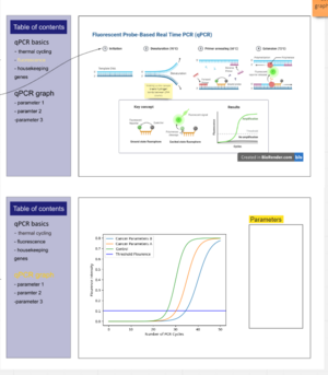
- The visualisation uses a scaffolding approach, where concepts are built upon through the entire visualisation. We first cover PCR, the technique built upon by qPCR, followed by looking at specific qPCR methods. In the next section, the result of these procedures, a qPCR graph, is discussed in more detail. Its shape is first described in the basics section, followed by methods needed to analyse it. We then finally introduce the factors affecting the Ct value in the graph one by one, before giving the user full access to an interactive graph with all the introduced complexity available (control of starting amount and the effect of a drug).
Graphical Design
General
- Most spaces are filled with custom made diagrams with captions to explain the different elements involved.
- Diagrams are designed or borrowed from biorender.com.
- Pages have a side section explaining concepts in text and a graphical panel on the right.
- Use of Imperial colour scheme throughout so visualisation clear to see. This is a colour blind friendly palette.
PCR and qPCR Reagants
DNA Strands
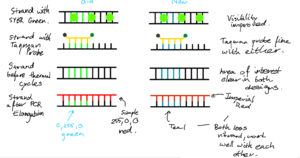
- Chose a simple design made of straight lines. A lot of abstraction is allowed, as learners focus is on understanding PCR/qPCR - they already have brilliant grasps on the structure of DNA and other reagants, so do not need the detail. For example, the double helix of structure of DNA is simply reduced to straight lines with bases connecting them. Bases in uniform colour too - we do not need to match complementary bases, learners are more than aware of it. We instead use different colours to signfify areas of interest on the strands.
- Specifically, a simple green (#00FF00) was used to indicate area where the primer attaches, making it stand out. Later, this was changed to Imperials Teal for consistency with the Imperial palette and for contrast with SYBR green, reserving green for fluorescence.
- Different colours for DNA were trialled, with black (#000000) eventually chosen for simplicity.
- The thickness of strands was also played around with. Very thin and very thick designs both look awful, and a midrange thickness was chosen.
- Rounded caps are used at the ends of the strands as they do look better.
Primers
- Settled on red for contrasting against the green of area of interest on DNA strands.
- Imperials Red used (#DD2501) in final design, for consistency with the Imperial palette. This still contrasts the teal areas of interest well.
Polymerase
- Polymerase simplified to a rounded rectangle, with two ellipses, similar to some designs in research.
- The rectangle is orange from the imperial palette (#D24000), whilst the ellipses are tangerine (#EC7300). The darker colour is used to indicate depth, as the elliptical components of the polymerase "wrap" around a strand.
Taqman Probe - Body
- The body of the probe was made in a style consistent with previous visuals - sharp angles, no rounding, mostly straight lines.
- Lemon yellow (#FFDD00) used for the body of the probe, from the Imperial palette. Differentiates the probe from other elements;different colour from thermal cycles elements.
Taqman Probe - Quencher and Fluorescent Probe
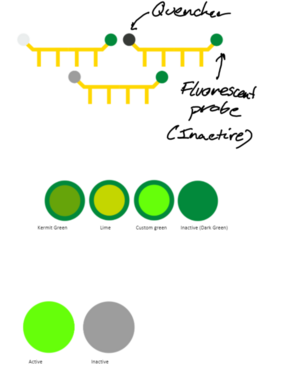
- The quencher is a completely passive element, so grey used to not stand out. Different greys from the Imperial palette looked at, and initially settled on dark grey (#373A36). Light grey a bit difficult to see against the white background, whilst dark grey simply stands out better than cool grey - however, when the probe was combined with a DNA strand, it looked better with cool grey. As a result, cool grey (#9D9D9D) used in final design.
- The fluorescent probe emits green light; Imperials dark green used to show that the probe is inactive. When probe is detached off taqman, fluorescene starts. The greens featured on the Imperial colour palette not deemed suitable. A more vibrant light green used (#66ff0a) after playing around with the colours.
SYBR Green Design
- An inactive and active version exist; when attached to dsDNA, the dye is active. Inactive otherwise. This is simply shown via colour change.
- The inactive version uses dark grey. As noted in the fluorescent probe section, dark grey looks better than other greys in the Imperial colour paletter when on its own.
- Active version features the same lime green that Taqman used, to indicate fluorescence consistently between the two.
Interaction Design
- Our first design included a large text box section however with feedback and self reflection we realised this wouldn't be engaging for the user even though it would be an efficient way to display information in a small space
- The final page of the qPCR graph section will allow users to tweak a qPCR curve with PCR parameters to observe how it can affect experimental outcomes.
- On the qPCR basics pages, the user can bring up more information by clicking the show more buttons. The extra information then will fade in, in place of the summary of the specific process. The user can then bring up another slide by clicking a different show more button, or go back to the summary by clicking the red cross.
- On the qPCR basics pages, the learner can play an animated version of the specific step in the qPCR/PCR process. A full animation of the entire process was liked by our peers, but with the change of format between the first draft and the final draft design, this is not included. To compromise, we include smaller pieces, distributed to each process.
- To navigate between the different visualisation pages, the user may scroll or directly click the relevant table of contents title. This flexibility is included as learners on revisits may not necessarilly require visiting all the sections, and may be more interested in a specific one or few.
- Different approaches are used for variety in end of section questions. These include checkboxes for multiple choice questions, draggable boxes for the ordering question for PCR steps and fillable parts for the Delta-Delta method. Prompts included to make sure the learner knows what to do in each section.
- All parts of visualisation include an ImpVis logo, permitting the user to go back to the ImpVis homepage, as direct consequence of feedback from our peers.
Progress and Future Work
- The design is not finalised, with the DNA production and qPCR graph subsections not completed.
- Including a home page with an introduction was suggested by our peers, and could be a good starting point for the visualisation.
Links
- Link to GitHub repository for code in development:
- Link to visualisation on ImpVis website (when uploaded):
- Link to Collection on ImpVis website (when created):
- https://miro.com/app/board/o9J_lpvA2AE=/?invite_link_id=762082753954
