Difference between revisions of "Advance toggle"
(Created page with "This page is a child of the Toggles page. The advance toggle component appears as a tray of options. It serves as a way to display options and highlighting the active on...") |
(No difference)
|
Revision as of 09:37, 28 June 2021
This page is a child of the Toggles page.
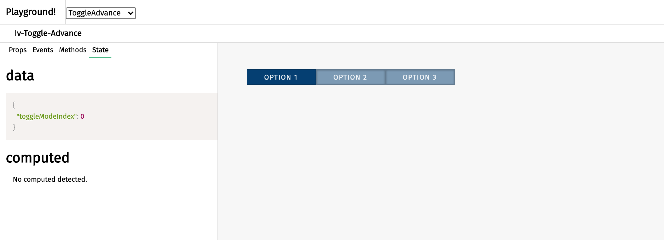
The advance toggle component appears as a tray of options. It serves as a way to display options and highlighting the active one. This component can be called using the iv-toggle-advance tag.
Technical information
The iv-toggle-advance is a button that allows users to switch between multiple modes.
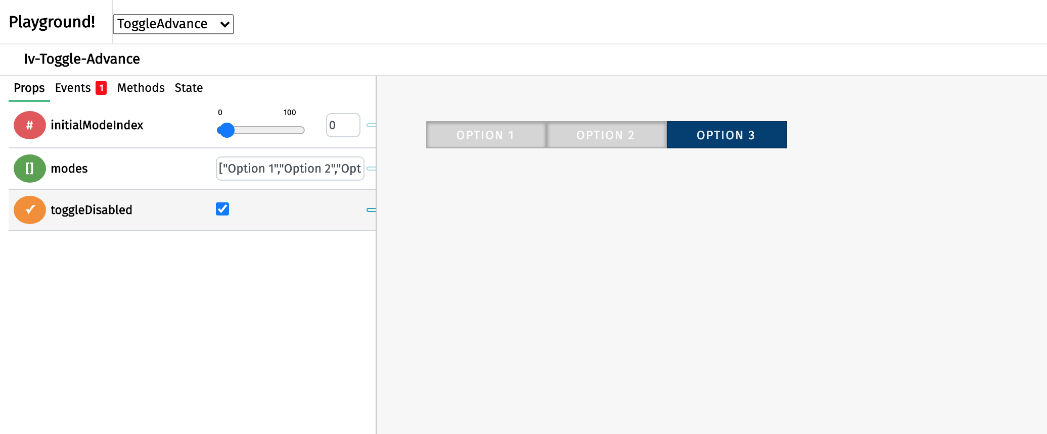
It is possible to disable the toggle. This component builds on Advance toggle button.
Props
Name: modes
Type: Array
Required: true
Default: ["Option 1", "Option 2", "Option 3"]
Description: The array container for the toggle modes text
Name: initialModeIndex
Type: Number
Default: 0
Description: Setting the initial toggle mode
Name: toggleDisabled
Type: Boolean
Default: false
Description: Disable the input
Events
Name: toggleswitched
Description: Emitted when the toggle is clicked
Value: toggleMode
Usage
To set the text for the options, create a prop with an array of the strings and bind the prop to modes. To disable the toggle, set the toggleDisabled prop as 'true'.
Design choice
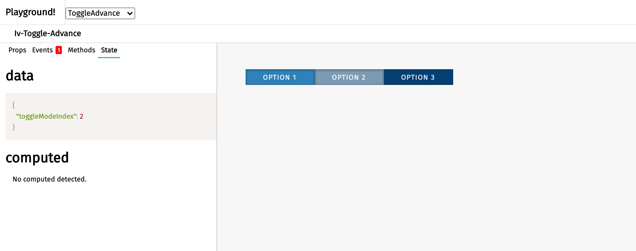
The blue button is chosen to fit in the general ImpVis blue. The lighter blue on the option upon cursor hovering gives the impression of active to tell the user the cursor is hovering over this option.


