Difference between revisions of "Heat Transport Visualisation"
Jump to navigation
Jump to search
| Line 29: | Line 29: | ||
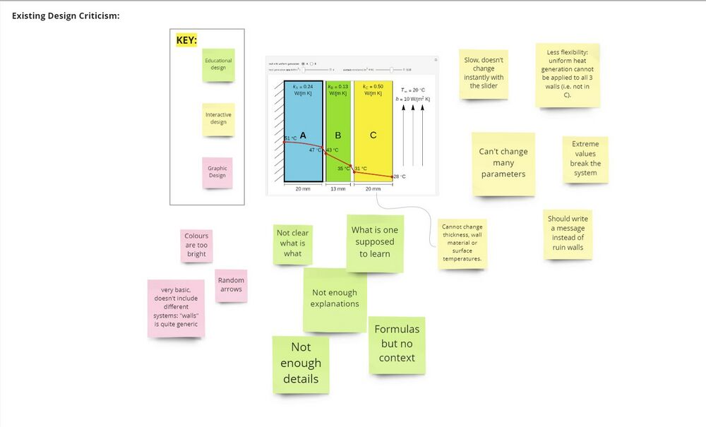
[[File:Visualisation_ideas.jpg|1000px|centre|thumb|Screenshot of [https://demonstrations.wolfram.com/HeatGenerationAndConductionThroughCompositeWalls/ WOLFRAM visualisation] with sticky notes for ideas for graphic, interactive and educational design improvements]] | [[File:Visualisation_ideas.jpg|1000px|centre|thumb|Screenshot of [https://demonstrations.wolfram.com/HeatGenerationAndConductionThroughCompositeWalls/ WOLFRAM visualisation] with sticky notes for ideas for graphic, interactive and educational design improvements]] | ||
* I then designed and created a resource on the topic | |||
Revision as of 13:57, 18 September 2022
Author - Helen
Summary
Redesigning an existing visualisation, to make it better
Motivation:
- The idea for this visualisation came after I had struggled to visualise a concept within my ‘Heat and Mass Transport 2’ module in the 2nd year of my degree (MEng Biomedical Engineering).
- I had found an existing visualisation online, by WOLFRAM: WOLFRAM Visualisation, but it had many limitations in its functionality. I therefore decided that I would redesign and improve it.
Intended User:
- 2nd year MEng Biomedical Engineering students, studying the module: BIOE50001
Mode of Learning:
- Independent study, study groups
Initial Visualisation Idea:
- The initial idea was to redesign the existing visualisation
Detailed Achievements
Design Process
- First, I worked with Dalia, using Miro to identify what needed to be improved and worked on in the new design, by brainstorming ideas for improved features.
Output

Screenshot of WOLFRAM visualisation with sticky notes for ideas for graphic, interactive and educational design improvements
- I then designed and created a resource on the topic