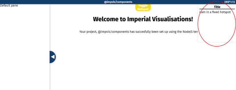
Toggle Hotspot
The Toggle Hostspot component creates a toggle hotspot with position of user's choice.
Props
Name: noWastedSpace
Type: Boolean
Default: false
Description: If true, the size of the hotspot will be just enough to fit the content, no extra space will be given
Name: title
Type: String
Default:
Description: Used to set the name of the toggle hotspot, which will appear on the toggle button
Name: glass
Type: Boolean
Default: false
Description: If true, the component covered by the hotspot will show on top of it
Name: position
Type: String
Required: true
Validator: ['top','bottom','topright','topleft','bottomright', 'bottomleft']
Description: Used to set the position of the hotspot
Name: size
Type: Number
Default: -1
Description: Used to set the explict size on the major axis of the hotspot, if set to -1 (default) will fill all available space
