Difference between revisions of "Toggle Hotspot"
| (5 intermediate revisions by the same user not shown) | |||
| Line 1: | Line 1: | ||
The | '''This component can be used in conjunction with [[Draggable Hotspot]].''' | ||
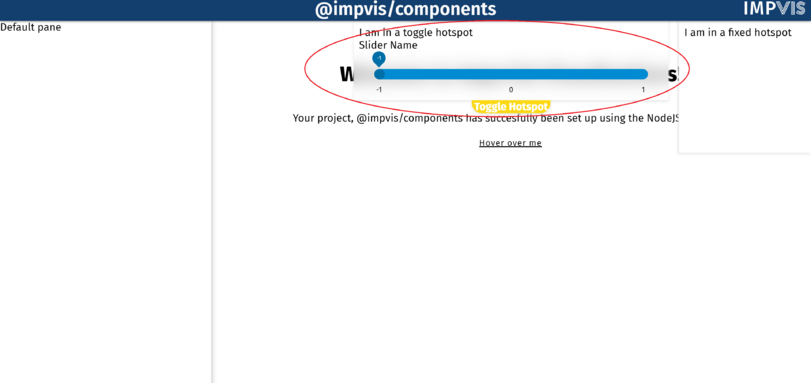
The <code>iv-toggle-hotspot</code> component creates a toggle hotspot with position of user's choice. | |||
<div class="res-img"> | <div class="res-img"> | ||
[[File: | [[File:Toggle hotspot.png|811x811px]] | ||
</div> | </div> | ||
==Technical Information== | |||
===Props=== | ===Props=== | ||
Name: draggable | |||
Type: Boolean | |||
Default: false | |||
Description: If true, the toggle button can be used with the draggable hotspot | |||
Name: noWastedSpace | Name: noWastedSpace | ||
| Line 11: | Line 23: | ||
Description: If true, the size of the hotspot will be just enough to fit the content, no extra space will be given | Description: If true, the size of the hotspot will be just enough to fit the content, no extra space will be given | ||
| Line 20: | Line 33: | ||
Description: Used to set the name of the toggle hotspot, which will appear on the toggle button | Description: Used to set the name of the toggle hotspot, which will appear on the toggle button | ||
| Line 29: | Line 43: | ||
Description: If true, the component covered by the hotspot will show on top of it | Description: If true, the component covered by the hotspot will show on top of it | ||
| Line 40: | Line 55: | ||
Description: Used to set the position of the hotspot | Description: Used to set the position of the hotspot | ||
| Line 49: | Line 65: | ||
Description: Used to set the explict size on the major axis of the hotspot, if set to -1 (default) will fill all available space | Description: Used to set the explict size on the major axis of the hotspot, if set to -1 (default) will fill all available space | ||
===Events=== | |||
None | |||
== Design Choice== | |||
The hotspot was made to be pure white to display content better, the button that toggles the hotspot was made to be yellow, which contrusts the main theme -- imperial blue. | |||
[[Category:Layouts]] | [[Category:Layouts]] | ||
Latest revision as of 08:45, 7 July 2021
This component can be used in conjunction with Draggable Hotspot.
The iv-toggle-hotspot component creates a toggle hotspot with position of user's choice.
Technical Information
Props
Name: draggable
Type: Boolean
Default: false
Description: If true, the toggle button can be used with the draggable hotspot
Name: noWastedSpace
Type: Boolean
Default: false
Description: If true, the size of the hotspot will be just enough to fit the content, no extra space will be given
Name: title
Type: String
Default:
Description: Used to set the name of the toggle hotspot, which will appear on the toggle button
Name: glass
Type: Boolean
Default: false
Description: If true, the component covered by the hotspot will show on top of it
Name: position
Type: String
Required: true
Validator: ['top','bottom','topright','topleft','bottomright', 'bottomleft']
Description: Used to set the position of the hotspot
Name: size
Type: Number
Default: -1
Description: Used to set the explict size on the major axis of the hotspot, if set to -1 (default) will fill all available space
Events
None
Design Choice
The hotspot was made to be pure white to display content better, the button that toggles the hotspot was made to be yellow, which contrusts the main theme -- imperial blue.
