Solid Angles Design
Contributors
- Cianne Park (student partner) 2021 Summer Team - BioEng
- Rishav Chatterjee (student partner) 2021 Summer Team - Computing
- Joshua Cheng (student partner) 2021 Summer Team - MechEng
- Robert Jones (student partner) 2021 Summer Team - Physics
Aims & Objectives
Solid angles are the 3D variant of a normal angle, commonly associated with the field of view of an observer. In physics, this topic is typically taught with a focus on its uses in Gauss’ law. Whilst the actual concept is not complex, the topic is not covered in as much detail as other areas, due to a lack of time and resources. Whilst resources exist online to improve their understanding, the time required to research and find suitable sources would be better spent on more difficult and vital concepts. For this reason, a visualisation has been designed to improve the conceptual understanding of solid angles along with its applications.
This visualisation is designed for self study use in 2nd year Electromagnetism course in the Physics department.
The intended learning objectives were:
Design Overview
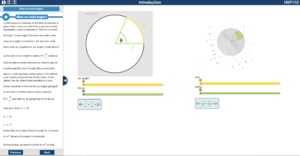
The first page has a circle showing the definition of an angle, which the students should be very familiar with. On the right hand side, is the three dimensional analogue with solid angles instead of a normal angle. The plot is 3D and made with plotly.js, users are able to pan, rotate and zoom to get a clear idea of what the picture is showing. The green lines in both plots represent the radii of the circle and sphere. As the arc length or area sliders are changed the plots will update to extend the arc length or shaded area in the respective plots. When the radii sliders are updated the radii of the sphere or circle will update in the plot above the slider only. The numbers in the equations will update as the sliders are changed.
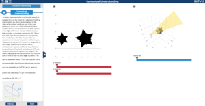
In the second page there are two plots which are intended to show the same scenario from different perspectives, as a result, adjusting any sliders will change both plots simultaneously. The plot on the left hand side is two dimensional and shows the view from the observer. The plot on the right hand side shows the three dimensional scenario, where the user can pan, resize and zoom to look around and get a full picture of what is going on. The position of the observer is shown as a person in the right hand side plot, along with their field of view which is shown as a semi-transparent cone.
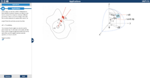
The third page shows static images to help improve understanding of how to apply the theory to questions. There is one more key equation to learn however no interactive diagrams are provided as they would not provide any benefit. Instead, the page has a toggle which would switch to display some example questions, along with buttons to show the solution.
Design Justification
Assessment criteria
i) Explain the key concepts of the problem through clear and engaging visualisations designed with a target audience in mind, using analogies where appropriate
ii) Create a simple and intuitive design with clear consideration of accessibility issues
iii) Clear design progression with justifications for choices
Education Strand
The 2D/3D comparison in the first page allows users to see that solid angles are just an extension of something they already know and boosts their confidence in their understanding. This use of analogy satisfies assessment criteria i). The equations for solid angle and angle are displayed and the values in these equations update dynamically with the plots, as the sliders are adjusted; this gives the students another perspective and helps clarify how solid angles work, addressing assessment criteria i).
In the second page, the student’s intuition about solid angles is improved by showing how solid angles are related to the familiar concept of field of view. This again satisfies assessment criteria i) with the analogy to a familiar concept. Allowing the user to move the object in 3D space and see how the solid angle changes introduces the fact that solid angles are dependent on the dot product of the separation vector and the surface vector through an intuitive example, satisfying assessment criteria ii).
Initially, we planned to add an additional section to page two where a flashlight was added and arbitrary shapes could be selected, however we decided that this would add too much complexity and potentially confuse the user so we removed this section. This progression of ideas towards a simplified design satisfies assessment criteria ii) and iii). We also moved from explicitly mentioning that 3D objects have a solid angle to simply using a 3D object in the visualisation and letting the students figure this out by playing around with it themselves since this will give them a more intuitive understanding; this satisfies assessment criteria ii) and iii). We decided to add a static diagram to page 2 which shows clearly how it is the projection of the object which gives the solid angle, as we thought that this effect may be too subtle to notice on the visualisation without prompting. This change towards a design with greater clarity satisfies assessment criteria i) and iii).
The third page shows students how solid angles are relevant to integration and Gauss’s law should motivate how important solid angles are. The integration example also shows how solid angles can be reached using simple trigonometry which the students should be familiar with; this gives an introduction to solid angles from a different perspective, helping the students get a more well rounded understanding. This satisfies assessment criteria i).
Graphics Strand
The design has used the Imperial Visualisation template due to its effective use of space along with appropriate positioning elements for the application. All of the interactive visualisations could be centred on the page as the main focus, with a clear information panel on the left to guide the user through the visualisation. This follows the Home Office Design recommendations for users with dyslexia, which could form a significant part of the target audience. Whilst there exist many other groups of users with various handicaps, catering to all of them would not be possible therefore efforts were focused on dyslexic users.
For all diagrams where comparison was a key part in understanding, the graphics were displayed side by side horizontally. Whilst this limited the maximum size of the graphics, it allowed the user to more easily recognise similarities and differences; use of a toggle to switch between the images would potentially cause frustration when having to repeatedly change diagrams. The result was a more intuitive design in accordance with criteria ii).
Colour coding the diagrams and sliders used would help to improve the user’s understanding, by improving comparison ability and highlighting key points of the images. On page one, the radius on both diagrams would have the same colour, whilst the arc length and surface area would also have their own colour. This highlights the similarity between the two concepts and aids the user in making this link. Similarly, the sliders corresponding to these variables also have the same respective colour; any use of the variable itself or its numerical value would also follow the same colour scheme as they are the key factors in the equation.
Positioning of the elements on the main area of the visualisation required consideration of the intuitiveness of the design. The diagrams are placed in the most central position as they are the key focus, with their titles just above. The sliders and equation could have been placed in a toggled hotspot however as the focus of the page is to understand the key factors of solid angles, they are positioned directly below the diagrams. Equations relating the variables are situated below the sliders to simulate the natural flow of thought for the user, from the variables and their values to the equation and the result.
Feedback noted the potential to improve the design by considering colourblind users when determining the colour scheme. [do research] Extensions for browsers exist which would automatically convert colours on a page to remove this issue. (https://addons.mozilla.org/en-GB/firefox/addon/axe-devtools/).
Interactivity Strand
Use of Sliders to adjust the parameters of the 2D and 3D figures [2D - arc length, radius; 3D - area, radius]. In page one the motivation behind using sliders apart from the ease of use was that it was best suited to assist the student to move on to the 3d figure once their intuition about the 2d structure was built (Familiarity would make the transition for the student simpler). In page 2, to adjust the x and z position in 2d and the object size in the 3d figure, sliders were implemented in the design keeping the user’s convenience the first priority.
The camera angles on the 3d figures on page 1 and 2 can be adjusted using a trackpad or mouse which would help the student get a better understanding of solid angles after using the visualisation by aiding the development of intuition regarding the topic.
Accessibility - The use of low contrast coloured sliders in a simple layout makes the visualisation accessible to a large audience. The parameters of the 2d and 3d figures can be adjusted using sliders that can be controlled via touch, mouse, trackpad as well as a keyboard which is another reason behind using sliders.
Progress & Future Work
A final design has been created for this visualisation, but development has not started.
Future work could include:
- Adding an interactive visualisation for page 3.
Resources
- Miro board showing design progression and tasks tree and other bits https://miro.com/app/board/o9J_l6BMMjQ=/
- Miro board showing design progression of the poster https://miro.com/app/board/o9J_lxFnwQY=/


