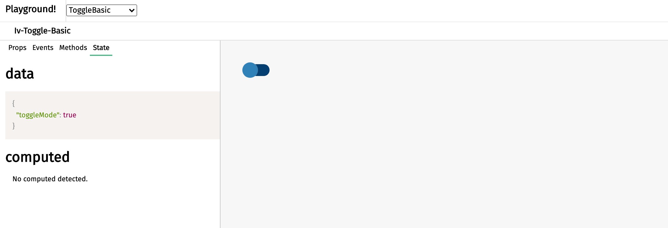
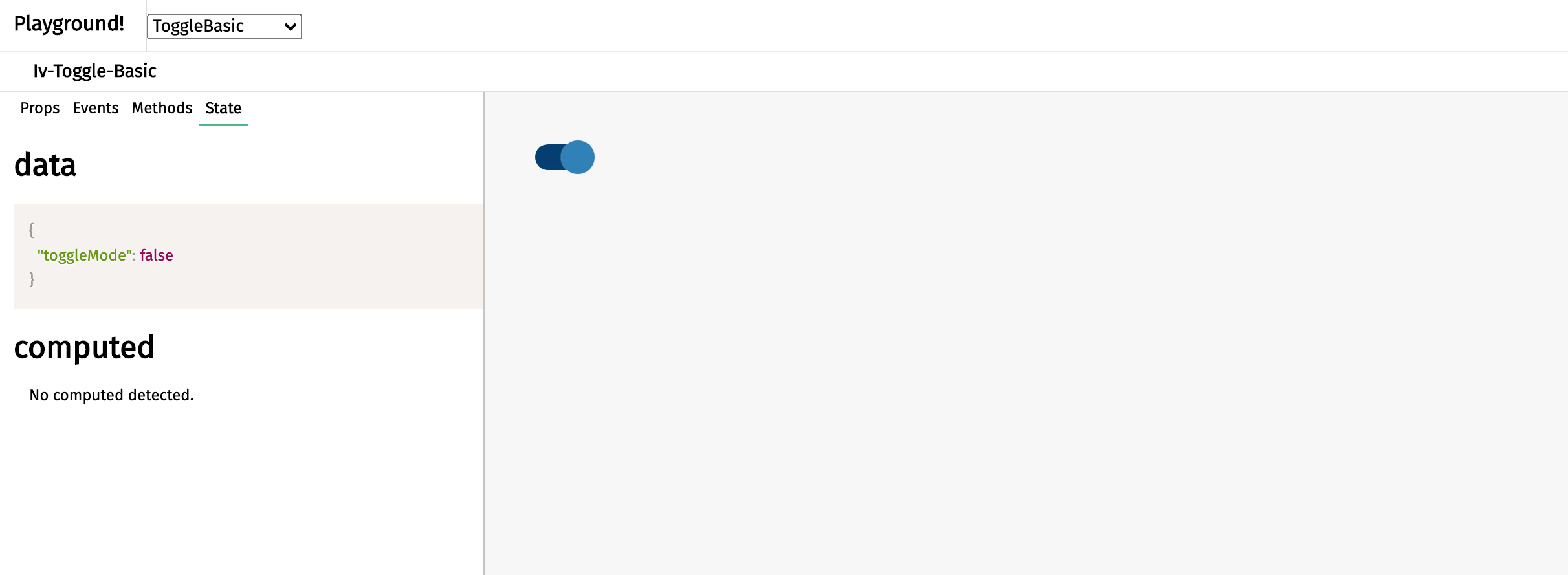
Basic toggle
This page is a child of the Toggles page.
The basic toggle component appears as a button that slides upon clicking and serves to allow user to pick between two choices. This component can be called using the iv-toggle-basic tag.
Technical information
It is possible to disable the toggle.
Props
Name: initialMode
Type: Boolean
Default: true
Description: Setting the initial toggle boolean
Name: toggleDisabled
Type: Boolean
Default: false
Description: Disable the input
Events
Name: toggleswitched
Description: Emitted when the toggle is clicked
Value: toggleMode
Usage
You may change the default mode by setting the initialMode prop to "false". To disable the toggle, set the toggleDisabled prop to "true".
Design choice
The blue button is chosen to fit in the general ImpVis blue while the grey button (toggle disabled mode) gives a sense of inactive.


