Dropdown Textbox
This page is a child of the Dropdowns page.
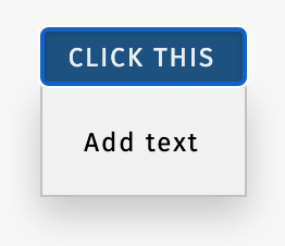
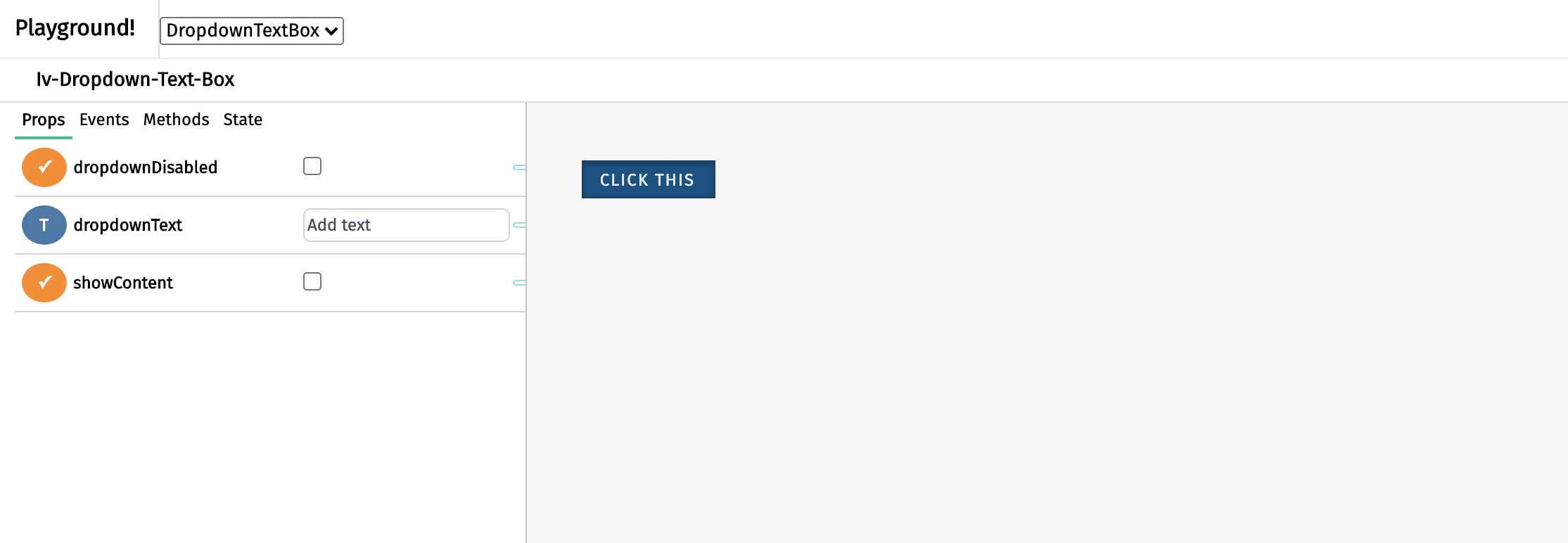
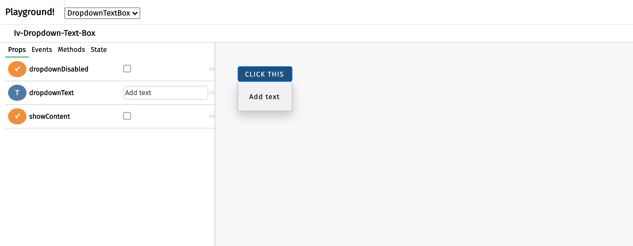
The dropdown text box component appears as a button with some text that becomes available or unavailable upon clicking. It serves as a way to hide explanatory text for saving space. This component can be called using the iv-dropdown-text-box tag.
Technical information
The iv-dropdown-text-box is a button allows users to display/hide a text box. It is possible to disable the dropdown.
Props
Name: buttonText
Type: String
Default: "Click me"
Description: The string for the button content
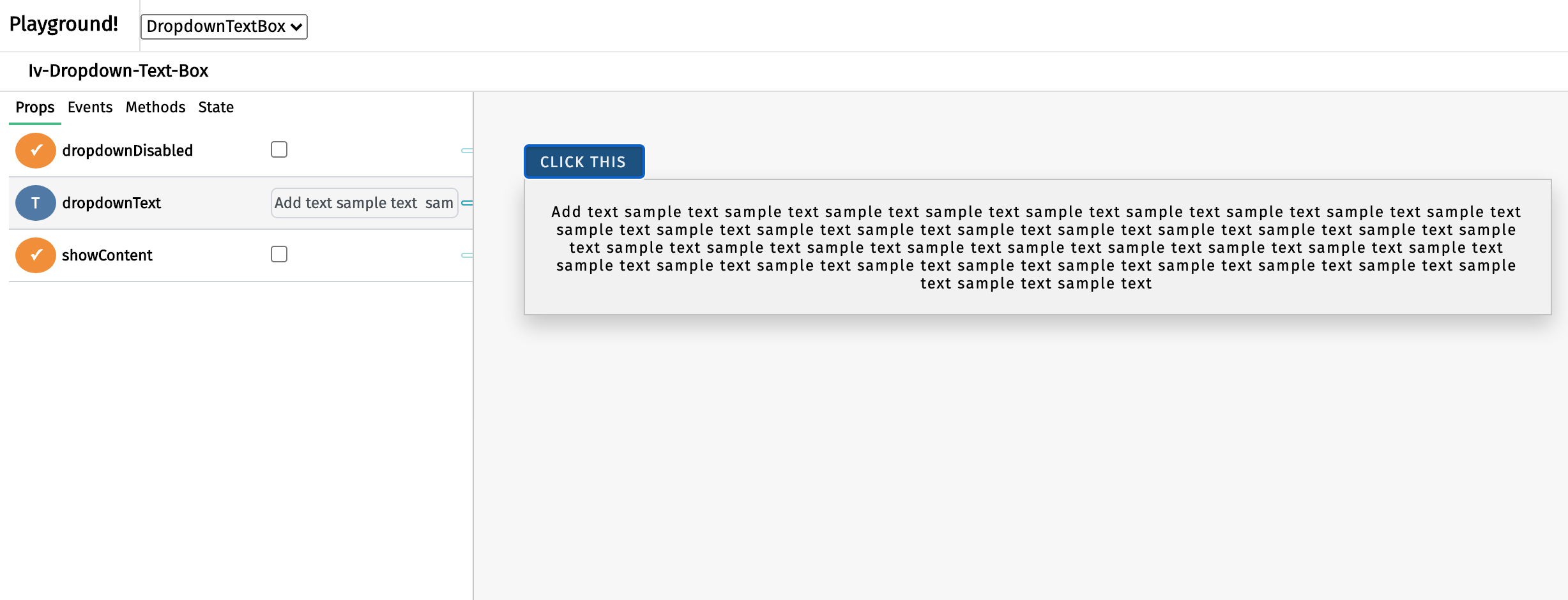
Name: dropdownText
Type: String
Default: "Add text"
Description: The string for the text box content
Name: dropdownDisabled
Type: Boolean
Default: false
Description: Disable the dropdown button
Events
Name: dropdownclicked
Description: Emitted when the dropdown button is clicked
Value: click event
Usage
To insert a text into the dropdown box, bind the text to the dropdownText prop. To change the button text, bind a new text to the buttonText prop. To disable the dropdown, set the dropdownDisabled prop as 'true'.
Design choice
The blue button is chosen to fit in the general ImpVis blue while the grey dropdown box acts as a flashcard.


