The wider determinants of health at Imperial's GP practices
This is a template which you can use to help get you started on the wiki submission. It is just intended as a guide and you may modify the structure to suit your project.
Contributors
- Justin Lau, Katerina Loupasaki, Regen Petu-Stiles
- Renee Ewe, Faculty of Medicine, School of Public Health. Staff partner from October 2021
- Viral Thakerar, Faculty of Medicine, School of Public Health. Staff partner from October 2021
- How was each person involved?
- Regen Petu-Stiles worked on the interactive design draft in the Figma prototype (as well as the general ideation and justification of the idea)
- Katerina Loupasaki worked on the education side of the project (identifying suitable indicators and data in the context of the target audience) as well as the general justification of the interaction and graphic design
- Justin Lau created a prototype of the visualisation which pulls live data from the Fingertips API and allows users to plot graphs on a pre-selected set of indicators and regions corresponding to the relevant location to Imperial GP practices and helped justify part of the education design.
- What rough dates did they contribute?
- We each contributed on the Monday of every week from the week beginning Monday 11th October and also worked asynchronously between the live sessions on Mondays.
- The staff-partners contributed on two distinct Wednesdays through a Microsoft Teams meeting (synchronous) as well as asynchronously via the Microsoft Teams channel where they posted feedback, advice and additional resources for the project
Aims & Learning Outcomes
- Explain the motivation for your visualisation
- Our Visualisation aims to introduce students to the wider determinants of health and prompt students to think about the association between different indicators and health outcomes in the population.
- This visualisation will be used to help first-year medical students prepare for the GP placements and understand how the health outcomes of the local populations are affected by the wider determinants of health. A visualisation is particularly useful in this context as it can better highlight associations between the different indicators compared to a simple text explanation which wouldn't allow for students to express curiosity and explore further associations depending on their interests.
- Target audience description: first-year medical students preparing for GP placement in the context of the Patients, Communities and Health module of their course. At this stage of their training, the students are being introduced to the wider determinants of health and will need to have a good understanding of how these affect health outcomes.
- Staff-partner brief:
- the visualisation should allow first-year medical students to become familiar with the wider determinants of health that affect the population in their GP practice areas and express curiosity regarding the associations between different indicators
- the visualisation will be used in the context of the Patients, Communities and Healthcare module for year 1 (phase 1a) medical students in preparation for the GP placement
- the visualisation is needed as the existing data base is large and difficult to navigate, existing visualisations are not tailored to the specific locations that the students will be allocated and they also feature a large number of indicators which can be overwhelming for first-year students. Therefore, the staff-partners requested that our visualisation includes a more concise list of indicators that will allow students to explore the wider determinants of health in specific areas as well as evoke their curiosity for further exploration
- Introduce the subject of your visualisation
- We are looking at socio-economic determinants of health and how they relate to overall health outcomes.
- These wider determinants extend beyond non-modifiable factors such as age and sex. They relate to the general social, economic, environmental and cultural aspects of a geographical location which in turn affect the health outcomes of the resident population.
- Examples of such indicators include: air pollution, access to green spaces, unemployment, pupil absence, and income deprivation. In turn, these might affect health outcomes such as: under 75 mortality rate from liver disease, life expectancy, % of diabetes.
- This visualisation is meant for use by students during e-learning and blended pre-reading for the Patients, Communities and Health Y1 (1a) Module.
- Learning outcomes:
- After using this visualisation, students should be able to:
- Identify the wider determinants of health in specific GP practice areas
- Relate specific determinants of health to their impact on health outcomes
- Recognize that different areas in London (and their associated GP practices) have populations that differ in terms of health outcomes
- After using this visualisation, students should be able to:
After using this visualisation, students should be able to explain how societal inequity relates to health outcomes as applied to the local area of GP practices.
Useful data sources:
Location of GP practices the students will attend: https://www.google.com/maps/d/u/0/viewer?mid=1ZA9dwGqH3NV-b-syChVyMip13k5ZSMv9&ll=51.554548833368905%2C-0.21984190000002068&z=11
GP-level data: https://fingertips.phe.org.uk/api
R/Python packages for GP-level data: https://fingertips.phe.org.uk/profile/general-practice/data#page/9/gid/2000005/pat/166/par/E38000245/ati/7/are/H85637/iid/639/age/28/sex/4/cat/-1/ctp/-1/cid/4/tbm/1
Wider determinants data (not GP level, but general area): https://fingertips.phe.org.uk/profile/wider-determinants
Design Overview
- What the final outcome was, how it looks, how it functions etc.
- Include graphics.
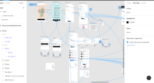
- Link to prototype: https://www.figma.com/file/vhPMjbpmZ8gvlAMMhqYNu0/Wireframing-(Copy)?node-id=0%3A1
- Do not include justification or design progression, leave this for later sections.
Design Justification
Assessment Criteria
- Education Design
- Target audience and their prior knowledge is clearly identified. This information is applied to decide what the learning outcomes should be.
- Key concepts identified and broken down into several discrete and easily achievable points.
- Graphical Design
- The design is such that the visualisation is clear and easily understood; the layout isn't cluttered.
- The choice of font, as well as size and placement of text, makes the information easy to comprehend
- The colour palette is appropriate and well justified, making it easy to see all text/design elements
- Interaction Design
- The learner should know intuitively what the objectives are of the visualisation.
- The user should be able to intuitively understand the function of each interactive element in the visualisation
- There should be immediate visual feedback when a learner interacts with the visualisation
- General
- The wiki page should give a clear overview of the project, and someone not familiar with the project should be able to understand it - no prior understanding necessary.
- The design choices should be well justified in the Wiki project page
- Fulfillment of staff partner's brief
Education Design
- What Methods were considered to convey concepts?
- Our staff-partners provided us with examples of existing visualisations that they considered suitable and we discussed any modifications that could be made. Following that discussion, we decided to produce scatter plots of the data (similar to existing examples https://fingertips.phe.org.uk/profile/wider-determinants/data#page/10/gid/1938133045/pat/6/par/E12000001/ati/402/are/E06000047/iid/93701/age/169/sex/4/cat/-1/ctp/-1/yrr/1/iid2/90366/age2/1/sex2/1/cat2/-1/ctp2/-1/yrr2/3/cid/4/tbm/1), but tailor the data to the target audience
- To fulfil the staff-partner brief in terms of the education design aspects, we compiled a list of the relevant GP practices and areas and included only those in our visualisation so as to make it relevant and beneficial for the students
- Given that the students are in their first year and have only recently been introduced to the wider determinants of health, we selected indicators that could produce graphs that will depict interesting associations that are useful in a GP setting.
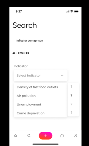
- Bearing in mind that the students may not be comfortable or entirely familiar with the wider determinants of health, we have included definitions of the indicators to help students understand what the variable they are selecting actually mean.
- Scaffolding: we have broken down the overarching concept of the wider determinants of health into distinct indicators that span the socioeconomic and environmental aspects. Having a list of specific indicators will allow the students to explore the wider determinants of health using specific examples, instead of being overwhelmed by the concept as a whole
- Students can also broaden their understanding of the wider determinants of health by selecting indicators that they find interesting. This can generate a number of different graphs while still ensuring that the students are taking away key concepts such as the relationship between indicators and health outcomes. This also means that students are achieving the intended learning outcomes and fulfilling the staff-partner brief: they're expressing curiosity about the wider determinants of health while learning about specific associations between indicators in their chosen area.
- We used the idea of prototyping to create a minimum viable product. In the future, the aim is to incorporate sliders/ other similar features to make the design entirely interactive
- Indicators can be selected allowing for a plot to be generated . This generation is not yet a feature we have integrated.
- How did we tailor the design to our target audience and their prior knowledge?
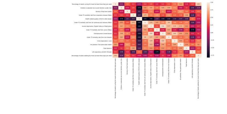
- As mentioned above, the target audience is first year medicine students at Imperial. Since the target audience consists of medicine students, who are unlikely to have worked with huge datasets before, we picked out the most relevant parts of the data to prevent them from being overwhelmed. From an original list of >1700 indicators, we have hand picked a few (<20 in total) which we believe are illuminating. The correlation matrix of the selected indicators is presented below. We have also narrowed down the choice of locations to 15 so only locations with student placements are included
- It is unlikely that medicine students would have a lot of experience in manipulating complex data visualizations, so we have decided to keep it simple by using a scatter plot with drop-down axis for selecting which indicators to plot against each other
- Even though some of the indicators themselves are related to medical terms, first year medical students may not have experience in analysing real world data, so they may not be familiar with the precise definitions of these terms- for example, 'Under 75 mortality rate from cardiovascular diseases' is one of the indicators. Possible points of confusion may include how to determine whether a death is due to cardiovascular disease- does it have to be a direct cause, or would an indirect one also count? How does one determine what the direct cause of death? It is also unlikely that they would be familiar with the technical definitions of some socio-economic indicators, such as how exactly is income depravation measured? As a result, we would have a wiki page with definitions of such terms and students would be able to look up confusing definitions with ease.
- Since students are only in their first year, they are not expected to be able to give in-depth explanations of how one indicator relates to another (e.g. higher proportion of adults cycling for travel and higher life expectancy). This is because they probably are not equipped with the technical knowledge to do so (in the medical sense). Also, explaining these relations would need a good grasp of correlation/causation between variables, which is not the focus of the medicine course. Instead, they are encouraged to think about the relationships which they found interesting and discuss them on the forum
- How did we come up with our learning outcomes and how do we measure them?
- As mentioned above, the aim of this visualisation is to help students prepare for their GP placements. It is important for them to be aware of the socio-economic background of the area their GP is located at, since different causes leading to the same problem may lead to a different approach of dealing with the problem. They also need to understand that socio-economic backgrounds can differ between different areas. So what they know about a certain area might not be true in another. Hence, we have listed identifying the wider determinants of health in specific GP practice areas, relating specific determinants of health to their impact on health outcomes and recognize that different areas in London (and their associated GP practices) have populations that differ in terms of health outcomes as learning outcomes. To measure the extent to which these outcomes are achieved, there will be a forum where students are encouraged to discuss their findings. For example, students allocated to the same area could talk about how their area differ from other areas- is there anything they should pay attention to in particular? Is there any health risk which they think will be more prominent in their area because of the socio-economic background? Can they verify whether this is true with actual data obtained from the NHS website?
- Design Justification: We went with the idea of an iPhone application for the basis of the platform. This allowed us to create a minimalist design that didn't overwhelm the user with information. It also allowed us to follow with the trend of accessibility, where students can contribute to research and discussions without needing a Personal Computer or laptop to hand. Passive and on-the-go studying is the space we are delving into.
- The colour pallet is predominantly white to allow for the plots and data visualisations to be clearly distinguished against the background.
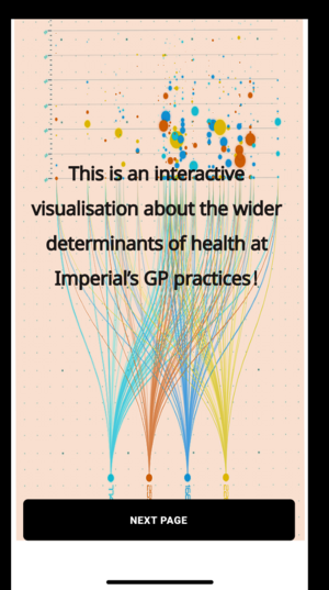
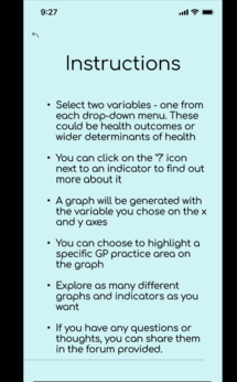
- How has feedback been incorporated: We placed a platform explanation of the first page to allow for a general understanding of the platform. This was part of the iterative improvement process from the feedback.
Graphical Design
- How were accessibility issues considered?
- We made sure to include large fonts and easily discernible objects
- The colour scheme used in the graphs includes variable and distinct colours to avoid confusion.
- It’s crucial to note that graphical design is inherently emotional. We considered colour theory heavily to make our choices. We used blue for warmer and less abrupt design elements, such as plots of less pressing health aspects.
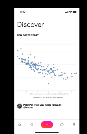
- Below is the Home screen.
- We also used red for alerts and green for positive signals. We attempted to match tones the information being conveyed. Through the blue coloured landing page, our call to action was clear and inviting.
- As we were using an iPhone screen primarily, we added widgets and a horizontal scrolling feature for ease of access.
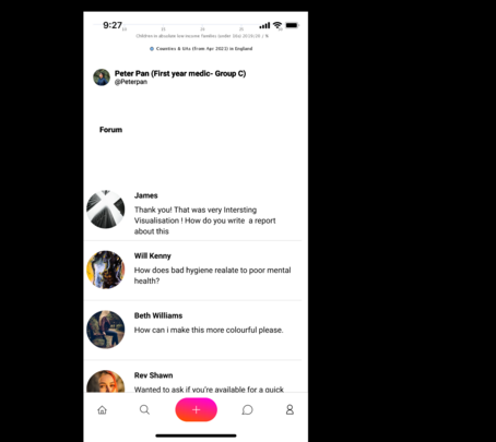
- We also implemented a discussion forum because we, as scientists believe research is collaborative. Here we considered, the flow of information and text, patterns, the 'Rule of Thirds' , a simple font and the left -to-right reading pattern to accommodate for Western Culture(where tis is being implemented)
- How was space used effectively?
- Objects of importance occupy the majority of each page and the absence of irrelevant elements or a cluttered design ensure that the visualisation is not overwhelming to navigate
- Key objects (e.g. graphs, indicator drop-down menus) are placed centrally to attract the users' attention
- Important information (e.g. instructions, indicator names) is written in clear, large fonts.
- How has feedback been incorporated: We made the design intuitive ang guided to incorporate feedback
Interaction Design
- Choice of interactive element(s) that fit in organically with the visualisation [inspiration of choice might be from lecture/in-class activity or other sources] - Sliders/Buttons/Cursor (hover/click)
- We have placed very large buttons on the bottom ends of the screen to allow a user to return to their original position.
- We have also made indicator choices large to make it easy to discern
- This is an image of the forum feature. The forum title is small as the focus should be on the visualisation
- Keeping accessibility of interactive elements in mind during design phase
- Interacting with the elements of the visualisation does not require specific technical knowledge and students only need to be able to use the drop-down menu to generate the graphs. The drop down menu is intuitive to use and there is immediate visual feedback upon selection of the indicators i.e. the graph is generated
- Design progression, With feedback incorporation: We added to the prototype by adding a feedback forum. This highlights the importance of student interaction. We also added a back button, this reset feature is important for understanding different areas of the visualisation.
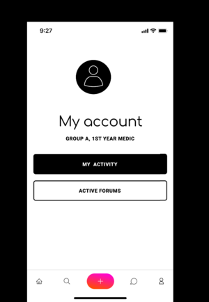
We also created anonymized accounts for students.
Anonymity allows for concepts of identity protection, sensitive issue discussion and evasion of directed online harassment to be addressed all in one.
Please note that this anonymity is only between users. Each contribution is logged by the platform, for each user.
Progress and Future Work
- Is the design finalised? Yes
- Which pages have been uploaded to website?
- Any ideas for future improvements
- Link more data to the visualisation
- Improve the forum element to increase student engagement and increase utility in the context of the Patients, Community and Healthcare module
- Potentially add more opportunities for reflection. For example before the graph is generated, a box could pop-up asking the student to predict what the graph will look like. Alternatively, the same could be done once the graph has been generated and the students could be asked to think of reasons why the association observed exists.
Links
- Link to GitHub repository for code in development: https://github.com/n88k/ImpVis-Wider-Determinants
- Link to visualisation on ImpVis website (when uploaded):
- Link to Collection on ImpVis website (when created):
- Any other links to resources (Miro boards / notes pages / Google Docs etc):
