Sidebar content
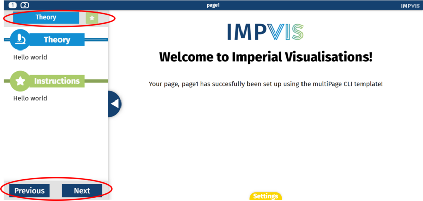
The iv-sidebar-contentcomponent creates a summary of all the sidebar sections at the top of the pane. It is placed inside the pane component. As the user scrolls down the pane, the display at the top of the pane reflects which sidebar section the user is on. Pagination can also be turned on, which shows previous/next buttons at the bottom of the pane which link to previous/next pages in the visualisation.
Technical Information
Props
showPagination
Type: Boolean
Default: true
Description: If true, will show previous/next buttons at the bottom of the pane which link to previous/next pages in the visualisation
title
Type: String
Required: true
Description: Title of the sidebar section
icon
Type: String
Default: 'star'
Description: Can specify the icon displayed next to the sidebar section title. Can choose any icon from this website.
highlight
Type: Boolean
Default: false
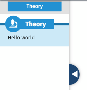
Description: If true, highlights the sidebar section.
Design Choice
The sidebar section title is in a boxed shape to make it stand out against any text. Icons can be specified to add a graphical visual element.


