Basic Component Tutorial
This article contains basic information on how to set up the Pane and Hotspot components. For how to write your own components, view Writing your own component.
Panes
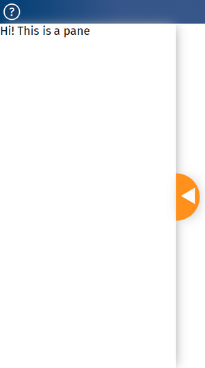
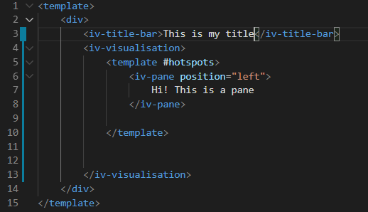
Panes are clickable and draggable environments to place text and images over a visualisation. The code seen below is what's needed to produce the pane seen to the right of this text; this can also be seen on the left hand side of Pane tutorial page.
== Adding SHM to the pane ==
Toggleable hotspots
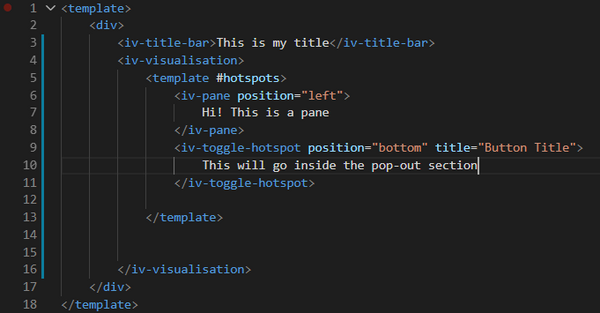
Hotspots overlay onto the page similarly to a Pane, but are smaller, and can be stuck on the corners or edges of a page. They can be used to house text or tools used to interact with a visualisation. The code pasted here demonstrates how to produce a toggleable hotspot, which is a hotspot that can be toggled in and out of the way of the visualisation.
An interactive version of the toggleable hotspot is found on thetoggle hotspot page of the ImpVis tutorial.
Fixed hotspots
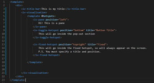
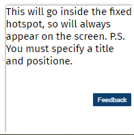
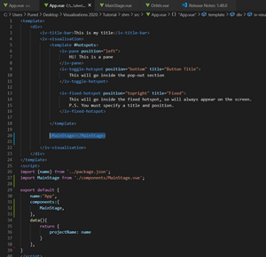
Hotspots can also be fixed in position so that they always appear onscreen, as opposed to being toggleable where they can be brought on and off. For example now, to add a fixed hotspot to the code on the previous page, we could write the code as seen below.
Notice how the hotspot overlays over the main content of the visualisation. We will later discuss how to use this feature effectively when designing the learning journey for the users of your visualisations. The screenshotted code would produce a fixed hotspot in the top right of the page. For this demonstration, I have displayed the hostspot in the bottom right for clarity. See the tutorial page on fixed hotspots to see this implemented online.
Importing your own components
Say you wanted to create your own component that does its own thing, you can import this as a separate file and use it in your visualisations.
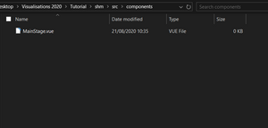
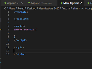
In order to use the file (which we will call MainStage.vue for now), you must export it. Everything you might want to use outside of the MainStage.vue file is written in the export default code block.
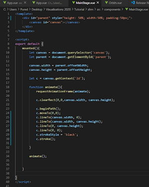
For example, we might want to create a canvas that we can display some interactive content in (check out the SHM visualisation, we'll go through some of that content here). To do this, we'd write the following pieces of code:
1.) Place the input from mainstage into the correct part of template (where you want it to go) in App.vue
2.) Insert the code that draws a box around the edges of the canvas drawing area on the screen (that's what we currently want to do, so we can see the canvas).
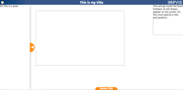
A screenshot of the result of this code is pasted below.
