Optical Microscopy
Contributors
Ganel Nallamilli - Student partner from October 2021 - Department of Physics
Malhar Mukne - Student partner from October 2021 - Faculty of Medicine
Michal Horansky - Student partner from October 2021 - Department of Physics
Jeffrey Kahol de Jong - Student partner from October 2021 - Faculty of Medicine
Dr Rackham and Dr Franklyn - Staff partners from October 2021
Optical Microscopy requires some background knowledge about lenses and light, this led to the two physics students, Ganel and Michal mainly working on education design and explanations of concepts and Malhar and Jeffrey focusing on the graphic and interaction design of the visualisation. Although each student had a specific role, oftentimes roles were mixed depending on availability.
Aims & Learning Outcomes
Optical microscopy describes the process of producing a magnified image of an microscopic object using system of lenses, typically using visible light.
This visualisation will be used as a teaching tool in MATE50005 (Materials Characterisation) lectures as well as self-study tools in lab sessions. It will also be useful in the MATE70001 module (MSc Characterisation course).
Note that this visualisation logically leads on to the scanning electron microscopy project.
Students are expected to know about basic one lens systems and how they affect incoming light rays. Under the "Image basics" tab in the visualisation, the student should be able to remind themselves of the basics of lenses and how they produce an image. From this basic understanding of lenses, the visualisation will slowly add to their knowledge of ray diagrams, and allow the student to make links to physical components of a microscope and how they affect the image produced.
After using this visualisation, students will be able to:
- explain the ray diagram of an optical microscope in reflection and transmission.
- describe the key properties of an optical system and identify the relevant contributing components.
- explain aberrations and its relevance in optical systems.
Design Overview
The visualisation is split into four components: "Overview", "Image Basics", "Chromatic Aberrations" and "Electron Microscopes". We expect the student to spend most of their time in the "Overview" section, which explains the key properties of each component in an optical microscope and relates the components to how they effect an image using a ray diagram. The "Image Basics" section is intended to be used as a refresher and is an overview of ray diagrams, this was an important feature to add as most of the project uses ray diagrams to explain the inner workings of a microscope. Not all pages are described below as they do not directly correspond to the aims or they mostly explain theory, to view these pages please visit the miro page which is linked at the bottom of the page under the heading links.
Overview Section
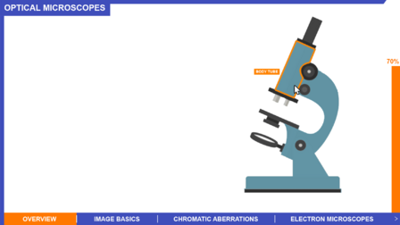
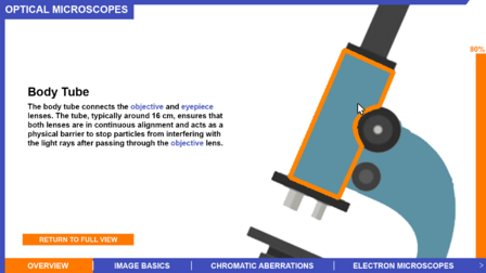
In the "Overview" section, the student can select one of the seven basic components of a microscope: body tube, eyepiece lens, objective lens, adjustment wheels, stage, condenser and illuminator. The main components which help the student understand how the optical microscope works using a ray diagram is the eyepiece lens, adjustment wheels and objective lens. For the other remaining components, their key properties are described along with their purpose in the microscope.
Eyepiece lens
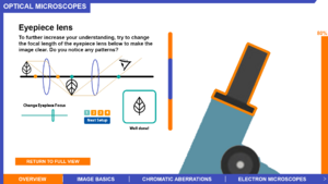
The eyepiece lens is used to explain the idea of the focus of a lens. In this section, the student should recognise that the focus of the eyepiece lens has to be in the same plane that the image is formed from the objective lens to produce a clear image when the image reaches the eyes. The student will move the slider to change the focus of the lens in each setup until the image is sharp, this gives the student an intuitive understanding of how the eyepiece lens contributes towards producing a good image and further develops their understanding of a ray diagram which represents an optical microscope. It was important to not overload information to the student during the interactive features as it could confuse them. For this reason, only one element of the ray diagram could be controlled in this section, to help the student become familiar with the setup.
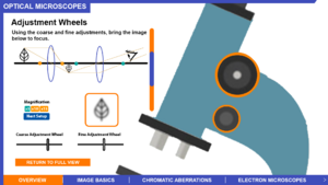
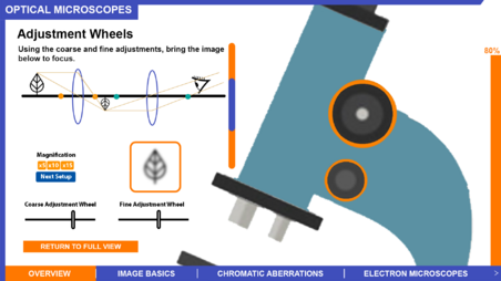
Adjustment Wheels
Changing the focus point of an eyepiece lens is not a realistic method to bring an image to focus as it would require multiple eyepiece lenses which isn't cheap and practically would take up a lot of space. In this section, the aim is to allow the student to recognise that changing the object distance to the objective lens, changes the position of the plane where the image is formed. The student must use the coarse slider and fine slider to bring the image into focus, similar to the eyepiece section. The coarse slider moves the object closer or further away from the objective lens in big distances. Once the student gets close to the image forming at the focus point of the eyepiece lens, the fine slider is used to move the object in the exact position such that the image formed is at the position of the eyepiece lens focus point. This gives a feel for the practical nature of the adjustment wheels while keeping it in the context of a ray diagram and allows the student to visually see how the thin lens equation works.
Objective Lens
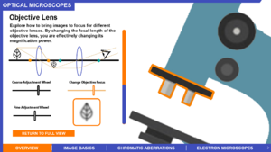
The objective lens is the main component which contributes to the magnification power of an optical microscope. The objective lens interactive feature allows the student to change all the individual features in previous sections at once, allowing them to fully explore how changing the objective lens focus point affects the magnification of the image. In this interactive feature, the eyepiece lens focus point is fixed which mimics a typical optical microscope, and changing the objective lens focus point is meant to resemble swapping the objective lenses. The student should intuitively understand why the image needs to be brought into focus every time the objective lens is changed in this interaction. After this interactive feature, the student should be able to explain the main features of a ray diagram of an optical system. Once the student reads the section about the illuminator they will understand the need for transmission and reflected light microscopy, this doesn't change the understanding of the ray diagrams.
Chromatic Aberrations
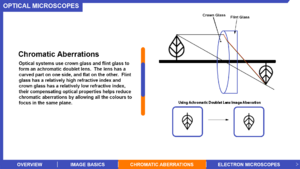
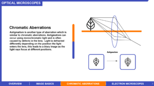
Chromatic Aberrations is explained before astigmatism as we thought it would be easier to understand. Chromatic Aberrations occur when using a light source composed of multiple colours such as white light. When white light enters a lens, the colours refract differently which means the image forms in different planes depending on the colour. This type of distortion of the image may prevent the user of the microscope from recognising certain elements of the sample as they may be stained, as shown in the slide, a crown and flint glass can be used to correct the dispersion. Astigmatism is then introduced after chromatic aberrations, which is usually caused by defects in the lens. Astigmatism affects all light sources, even monochromatic light sources, as it refracts light differently due to the physical abnormalities of the lens which results in light rays being focused at different points. This causes a blurry image to be seen, which is a critical problem when it comes to identifying features of a specimen in a microscope as the resolution is affected.
Electron Microscopes
This section briefly describes the similarities between optical microscopes and electron microscopes.
- What the final outcome was, how it looks, how it functions etc.
- Include graphics.
- An overview of the planning process and mock-ups of what the visualisation may look like are available here: https://miro.com/app/board/o9J_lpvA2Dg=/
Design Justification
Assessment Criteria
General:
- Fulfilment of staff partner's brief.
- The design choices should be well justified in the Wiki project page.
- The wiki page should give a clear overview of the project, and someone not familiar with the project should be able to understand it - no prior understanding necessary.
Education Design:
- Target audience and their prior knowledge is clearly identified. This information is applied to decide what the learning outcomes should be.
- Key concepts identified and broken down into several discrete and easily achievable points.
Graphic Design:
- The design is such that the visualisation is clear and easily understood; the layout isn't cluttered.
- The choice of font, as well as size and placement of text, makes the information easy to comprehend.
- The colour palette is appropriate and well justified, making it easy to see all text/design elements.
Interaction Design:
- There should be immediate visual feedback when a learner interacts with the visualisation.
- The user should be able to intuitively understand the function of each interactive element in the visualisation.
- The learner should know intuitively what the objectives are of the visualisation.
Education Design
- We decided to use the concept of selective enhancement to convey details across clearly. This happens when the user clicks on/ hovers over a component. When the user hovers over a component is becomes outlined in orange. When the user clicks on a component, the component will be zoomed into and a pop-up tab containing information will appear. This allows the user to focus on one bit of information at a time which improves their understanding and enhances their learning experience.
- We have given the user a lot of control over how they progress through the visualisation, so that they can learn at their own pace. They can revisit components or pages whenever they like to consolidate their understanding.
- We have included a section to go over more basic concepts so that they have sufficient knowledge to understand the rest of the visualisation.
- We split the learning up into components, image basics and chromatic aberrations as to not overwhelm the user - different/more challenging concepts are separated so the user can progress onto them as they see fit.
- How has feedback been incorporated.
Graphical Design
- We designed the visualisation so the colour-blind people can learn from it.
- Design progression, key choices with justifications.
- Originally we chose a colour palette filled with contrasting primary colours. However, we realised that the colours clashed quite a lot and looked unprofessional and could potentially distract the learner from the information presented to them. We decided instead to use a colour palette composed of black, blue and grey with some bright colours which guide the user. This looks more professional and doesn't distract the user with too many bright colours.
- A progression bar was included to let the users know how far they had progressed through the visualisation. This means that the users wouldn't miss anything, and gives them more incentive to finish everything on the page that they are on.
- There is a sharp contrasting border around the edge of the visualisation, clearly setting out the title at the top and topics at the bottom of the page. The border continues along the top and left-hand side of the screen to indicate that there is no element/progression on that side of the visualisation, focusing the user on the visual elements that are there. This is omitted on the right hand side to make way for the progress bar.
- Pop-up text boxes were used for efficient use of space.
- How has feedback been incorporated.
- Clicking on the different parts of the visualisation is an inherently understandable process.
Interaction Design
- Choice of interactive element(s) that fit in organically with the visualisation [inspiration of choice might be from lecture/in-class activity or other sources] - Sliders/Buttons/Cursor (hover/click).
- Keeping accessibility of interactive elements in mind during design phase.
- Design progression, key choices with justifications.
- How has feedback been incorporated.
- The opening page is a schematic of a microscope, which users can interact with by clicking on different components. As the user hovers over a component, it becomes outlined in orange, indicating that it can be interacted with. Once the user clicks on a component, the visualisation zooms into that particular component, and information appears relating to it. The user can then read the information and return to the main diagram whenever they wish. As each component is selected, a progress bar on the right-hand side will go up, providing the user with information about how many components they have covered and giving them incentive to find all of them.
- Some components/topics have activities for the user - they can adjust the components themselves through the diagrams we have provided, to see how that part affects the image that is produced by the microscope. This allows them to consolidate their understanding as well.
Visit our miro board (project blue) to see our designs for each page. Link can be found at the bottom of the page.
Progress and Future Work
- Is the design finalised?
- Which pages have been uploaded to website?
- Any ideas for future improvements.
- Work in progress.
- Working on the explanations provided on each page, and the organisation of topics (all of which are easily modifiable).
- We expect to go into more detail on electron microscopes in the future.
Links
- Link to GitHub repository for code in development:
- Link to visualisation on ImpVis website (when uploaded):
- Link to Collection on ImpVis website (when created):
- Any other links to resources (Miro boards / notes pages / Google Docs etc): https://miro.com/app/board/o9J_lpvA2Dg=/
- Can see planning process and mock-ups of the pages of the visualisation
