X-ray diffraction
Revision as of 19:56, 1 December 2021 by JacobEdginton (talk | contribs) (Addition of images for design overview)
This is a template which you can use to help get you started on the wiki submission. It is just intended as a guide and you may modify the structure to suit your project.
Contributors
- Jacob Edginton - Department of Physics (student partner) - Term 1 2021
- Hans Lee - Department of Physics (student partner) - Term 1 2021
- Benjamin Smith - Department of Mathematics (student partner) - Term 1 2021
- Ziang Yan - Department of Mathematics (student partner) - Term 1 2021
- Jonathan Rackham, Department of Materials. Staff partner from October 2021.
Aims & Learning Outcomes
- Explain the motivation for your visualisation.
- Introduce the subject of your visualisation.
- Which module and year is it intended for and which setting (lecture or self study)?
This visualisation would be used as teaching tools in MATE50005 (Materials Characterisation, second year undergraduate) lectures as well as self-study tools in lab sessions. It will also be useful in the MATE70001 module (MSc Characterisation course).
After using this visualisation, students will be able to:
- qualitatively describe the relationship between direct and reciprocal lattices.
- discuss the features of reciprocal space and how they relate to a crystal’s structure.
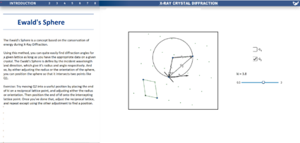
- relate the motion of a diffractometer to that of the scattering vector through reciprocal space.
- evaluate the effect of experimental conditions on the diffraction patterns obtained.
Design Overview
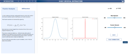
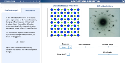
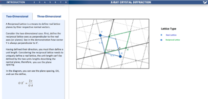
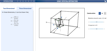
- What the final outcome was, how it looks, how it functions etc.
- Include graphics.
Design Justification
Assessment Criteria
- List your cohort's assessment criteria. You may want to number the assessment criteria so you can refer to them easily later.
Education Design
- What Methods were considered to convey concepts?
- Design progression, key choices with justifications.
- How has feedback been incorporated.
Graphical Design
- How were accessibility issues considered?
- How was space used effectively?
- Design progression, key choices with justifications.
- How has feedback been incorporated.
- How is the design intuitive?
Interaction Design
- Choice of interactive element(s) that fit in organically with the visualisation [inspiration of choice might be from lecture/in-class activity or other sources] - Sliders/Buttons/Cursor (hover/click).
- Keeping accessibility of interactive elements in mind during design phase.
- Design progression, key choices with justifications.
- How has feedback been incorporated.
Progress and Future Work
- Is the design finalised?
- Which pages have been uploaded to website?
- Any ideas for future improvements.
Links
- Link to GitHub repository for code in development:
- Link to visualisation on ImpVis website (when uploaded):
- Link to Collection on ImpVis website (when created):
- Any other links to resources (Miro boards / notes pages / Google Docs etc):
