Basic Component Tutorial
This article contains basic information on how to set up the Pane and Hotspot components. For how to write your own components, view Writing your own component.
Panes
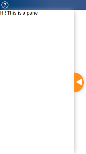
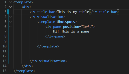
Panes are clickable and draggable environments to place text and images over a visualisation. The code seen below is what's needed to produce the pane seen to the right of this text; this can also be seen on the left hand side of Pane tutorial page.
Toggleable hotspots
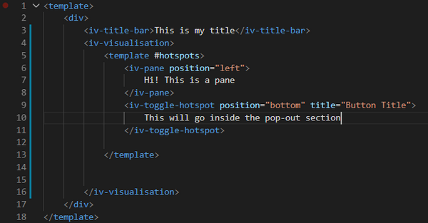
Hotspots overlay onto the page similarly to a Pane, but are smaller, and can be stuck on the corners or edges of a page. They can be used to house text or tools used to interact with a visualisation. The code pasted here demonstrates how to produce a toggleable hotspot, which is a hotspot that can be toggled in and out of the way of the visualisation.
An interactive version of the toggleable hotspot is found on the toggle hotspot page of the ImpVis tutorial.


