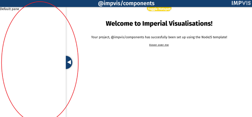
Pane
The iv-pane component creates a pane on either the right or the left hand side of the page.
Technical Information
Props
Name: width
Type: Number
Default: 400
Description: Used to set the width of the pane
Name: format
Type: String
Default: 'push'
Validator: ['overlay','push']
Description: Used to set the pane to different mode (i.e. it lays on top of the main stage or it pushes the main stage to the side)
Name: glass
Type: Boolean
Default: false
Description: If true, turns the opacity of the pane to 0
Name: allowResize
Type: Boolean
Default: false
Description: If true, allows users to resize the pane
Events
mouseup and mousemove
Description: Allow draggable resize using mouse.
touchmove and touchend
Description: Allow draggable resize using touchscreen.
paneReveal, paneHide, paneToggle
Description: Emits respective events when pane is revealed, hidden or just toggled. Can listen to any event and get the new width of the pane (except for paneHide as you know the width is 0). Emits events consistent to main-stage shifting, when hidden it outputs 0 immediately, when revealed it outputs the end width after css animation has completed. Width emitted as Number.
paneResize
Description: Emits this event as user resizes the pane. Provides the width as the user drags the pane. Width emitted as Number.
Design Choice
The pane was made to be pure white and the toggle button was made to be imperial blue to match the theme.
