Difference between revisions of "ImpVis template description"
| Line 13: | Line 13: | ||
There are four corner hotspots and then four edge hotspots that lie in between. These edge hotspot areas can contain multiple sub hotspots, unlike the corners. Within a single hotspot, you can stack several block elements such as a sliderBlock, which have been pre-made to be easy to set up - think IKEA. Note, if you have panes either side of the visualisation, (e.g. a pane on the left-hand side), then it's advisable not to use components in hotspots on the same side as panes (i.e., on the left-hand side in this case). This is because the pane may cover the component in the hotspot if dragged. | There are four corner hotspots and then four edge hotspots that lie in between. These edge hotspot areas can contain multiple sub hotspots, unlike the corners. Within a single hotspot, you can stack several block elements such as a sliderBlock, which have been pre-made to be easy to set up - think IKEA. Note, if you have panes either side of the visualisation, (e.g. a pane on the left-hand side), then it's advisable not to use components in hotspots on the same side as panes (i.e., on the left-hand side in this case). This is because the pane may cover the component in the hotspot if dragged. | ||
== Further reading == | |||
Read about how to [[Organising Content|organise your content]] within the ImpVis template. | |||
[[Category:ImpVis Template]] | [[Category:ImpVis Template]] | ||
Revision as of 09:44, 28 September 2021
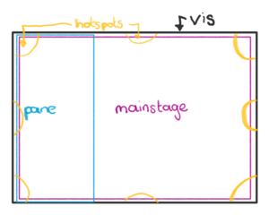
The ImpVis visualisation template layout consists of a number of main components, each layering on top of the other. At the back of the whole visualisation lies the "vis" component. This houses all components built up on top of one another, other than the title bar and the guidance system. You can explore the template and its components in this demo visualisation.
"vis", "pane" and "mainstage"
In order of increasing height, we have “vis,” which houses everything. On top of this, “pane” and “mainstage” are used. Panes are designed to accommodate the bulk of text content, while the mainstage houses interactive content. The layout of visualisations is designed such that explanatory text is positioned to the side of main visualisations in a pane; the pane may be overlaid onto the main interactive part of the visualisation itself or push the visualisation into a more narrow window. Multiple panes can be used on any side of the mainstage. Still, most of our visualisations so far have chosen to have a single pane to the left of the mainstage. The panes are at the same height as the mainstage.
Inside the pane can go any of the other components, emphasizing usage for text; for example, text dropdowns. The pane is toggleable and draggable, in that it can be dragged wider/thinner to show more/fewer words per line, and that there is a click to open/close button which moves it on/off the screen.
The mainstage can also house any of the other components (apart from panes), focusing on interaction. In particular, these house the "hotspots" - used to keep the layering system well organised and clean. They act as anchors within the mainstage on which components appear on top of the mainstage land.#
"hotspots"
There are currently three different types of hotspots: togglable, draggable and fixed. Fixed hotspots can be used to contain elements that need to be seen at all times but are distinct from the main stage visualisation. Togglable hotspots act as a small dockable component; they are meant to contain essential components to the visualisation but don't need to be seen at all times. This might include buttons, sliders, checkboxes, and small graphs, etc. Draggable hotspots are similar to togglable hotspots, but can appear at the top left of the vis when clicked and can then be dragged by the user to any location.
There are four corner hotspots and then four edge hotspots that lie in between. These edge hotspot areas can contain multiple sub hotspots, unlike the corners. Within a single hotspot, you can stack several block elements such as a sliderBlock, which have been pre-made to be easy to set up - think IKEA. Note, if you have panes either side of the visualisation, (e.g. a pane on the left-hand side), then it's advisable not to use components in hotspots on the same side as panes (i.e., on the left-hand side in this case). This is because the pane may cover the component in the hotspot if dragged.
Further reading
Read about how to organise your content within the ImpVis template.
