Difference between revisions of "Draggable Hotspot"
| Line 42: | Line 42: | ||
==Design Choice== | ==Design Choice== | ||
The toggle hotspot button was used in the draggable hotspot | The toggle hotspot button was used in the draggable hotspot to keep consistency with the toggle hotspot itself. The color of the drag me bar and the close button are set to be the same color as the toggle button | ||
[[Category:Layouts]] | [[Category:Layouts]] | ||
Revision as of 08:52, 7 July 2021
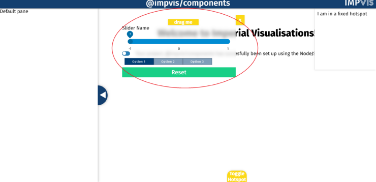
The iv-draggableDiv component is used to create a draggable hotspot across the main visualisation stage.
Technical Information
How to Use
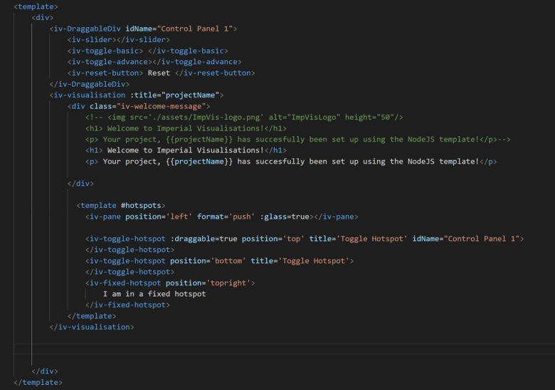
To use the iv-draggableDiv component, put this tag outside the iv-visualisation tag. To add the toggle button to open this div, inside the #hotspots template, add the iv-toggle-hotspot tag and set the draggle prop to be true. To bind the div and the toggle button together, give the same idName to both. An example code is shown below:
Props
Name: idName
Type: String
Required: true
Default: "Name_1"
Description: Need to be included so that by matching it with the idName of the iv-toggle-hotspot component, the two can be binded together
Name: glass
Type: Bollean
Default: true
Description: Used to create glass effect
Name: transparent
Type: Bollean
Default: false
Description: Used to create transparent effect
Events
None
Design Choice
The toggle hotspot button was used in the draggable hotspot to keep consistency with the toggle hotspot itself. The color of the drag me bar and the close button are set to be the same color as the toggle button

