Difference between revisions of "Draggable Hotspot"
| Line 3: | Line 3: | ||
[[File:Draggable-hotspot.png|740x740px]] | [[File:Draggable-hotspot.png|740x740px]] | ||
</div> | </div> | ||
==Technical Information== | |||
===How to Use=== | |||
To use the <code>iv-draggableDiv</code> component, put this tag inside the <code>iv-visualisation</code> tag but oustside the <code>#hotspots</code> template. To add the toggle button to open this div, inside the <code>#hotspots</code> template, add the <code>iv-toggle-hotspot</code> tag. To bind the div and the toggle button together, give the same idName to both. An example code is shown below: | |||
<div class="res-img">[[File:Hotspot-example-1.png|780x780px]] | |||
</div> | |||
===Props=== | |||
Name: idName | |||
Type: String | |||
Required: true | |||
Default: "Name_1" | |||
Description: Need to be included so that by matching it with the idName of the iv-toggle-hotspot component, the two can be binded together | |||
Name: glass | |||
Type: Bollean | |||
Default: true | |||
Description: Used to create glass effect | |||
Name: transparent | |||
Type: Bollean | |||
Default: false | |||
Description: Used to create transparent effect | |||
===Events=== | |||
None | |||
==Design Choice== | |||
The toggle hotspot button was used in the draggable hotspot | |||
[[Category:Layouts]] | [[Category:Layouts]] | ||
Revision as of 12:31, 6 July 2021
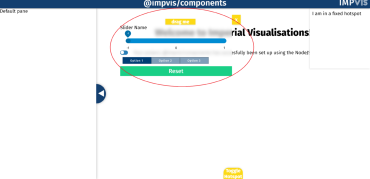
The iv-draggableDiv component is used to create a draggable hotspot across the main visualisation stage.
Technical Information
How to Use
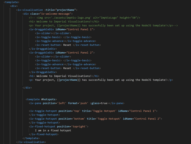
To use the iv-draggableDiv component, put this tag inside the iv-visualisation tag but oustside the #hotspots template. To add the toggle button to open this div, inside the #hotspots template, add the iv-toggle-hotspot tag. To bind the div and the toggle button together, give the same idName to both. An example code is shown below:
Props
Name: idName
Type: String
Required: true
Default: "Name_1"
Description: Need to be included so that by matching it with the idName of the iv-toggle-hotspot component, the two can be binded together
Name: glass
Type: Bollean
Default: true
Description: Used to create glass effect
Name: transparent
Type: Bollean
Default: false
Description: Used to create transparent effect
Events
None
Design Choice
The toggle hotspot button was used in the draggable hotspot

