Difference between revisions of "Fixed Hotspot"
(→Props) |
|||
| Line 49: | Line 49: | ||
Description: Used to set the explict size on the major axis of the hotspot, if set to -1 (default) will fill all available space | Description: Used to set the explict size on the major axis of the hotspot, if set to -1 (default) will fill all available space | ||
===Events=== | |||
None | |||
===Design Choice=== | |||
The hotspot was chose to have a white background such that it can clearly present the content. | |||
[[Category:Layouts]] | [[Category:Layouts]] | ||
Revision as of 08:46, 1 July 2021
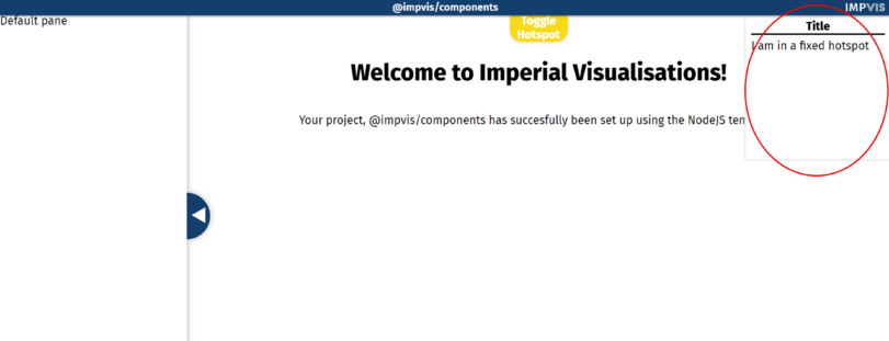
The Fixed Hostspot component creates a fixed hotspot with position of user's choice.
Props
Name: noWastedSpace
Type: Boolean
Default: false
Description: If true, the size of the hotspot will be just enough to fit the content, no extra space will be given
Name: transparent
Type: Boolean
Default: false
Description: If true, the background of the hotspot will be transparent
Name: glass
Type: Boolean
Default: false
Description: If true, the component covered by the hotspot will show on top of it
Name: position
Type: String
Required: true
Validator: ['top','bottom','topright','topleft','bottomright', 'bottomleft']
Description: Used to set the position of the hotspot
Name: size
Type: Number
Default: -1
Description: Used to set the explict size on the major axis of the hotspot, if set to -1 (default) will fill all available space
Events
None
Design Choice
The hotspot was chose to have a white background such that it can clearly present the content.
