Difference between revisions of "Pane"
Jump to navigation
Jump to search
| Line 10: | Line 10: | ||
Description: Used to set the width of the pane | Description: Used to set the width of the pane | ||
Name: format | Name: format | ||
| Line 20: | Line 21: | ||
Description: Used to set the pane to different mode (i.e. it lays on top of the main stage or it pushes the main stage to the side) | Description: Used to set the pane to different mode (i.e. it lays on top of the main stage or it pushes the main stage to the side) | ||
Name: glass | Name: glass | ||
| Line 28: | Line 30: | ||
Description: If true, turns the opacity of the pane to 0 | Description: If true, turns the opacity of the pane to 0 | ||
Name: allowResize | Name: allowResize | ||
Revision as of 14:13, 30 June 2021
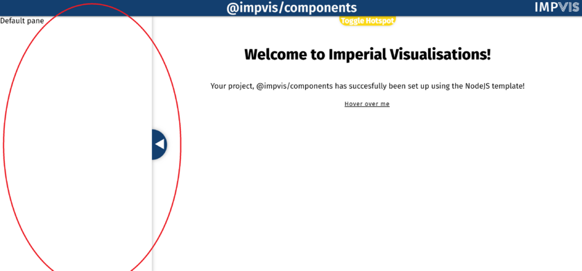
The pane component creates a pane on either the right or the left hand side of the page.
Props
Name: width
Type: Number
Default: 400
Description: Used to set the width of the pane
Name: format
Type: String
Default: 'push'
Validator: ['overlay','push']
Description: Used to set the pane to different mode (i.e. it lays on top of the main stage or it pushes the main stage to the side)
Name: glass
Type: Boolean
Default: false
Description: If true, turns the opacity of the pane to 0
Name: allowResize
Type: Boolean
Default: false
Description: If true, allows users to resize the pane
