Difference between revisions of "Visualising academic integrity research terminology"
(Design Overview) |
|||
| Line 20: | Line 20: | ||
==Design Overview== | ==Design Overview== | ||
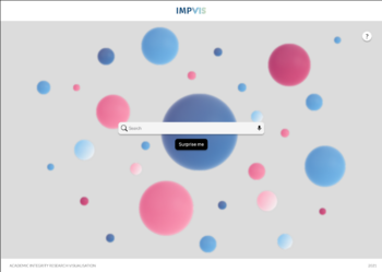
[[File:Main Page.png|thumb|350x350px|Figure 1: The | [[File:Main Page.png|thumb|350x350px|Figure 1: The home page of the visualisation.]] | ||
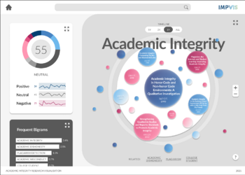
[[File:ExamplePage.png|thumb|350x350px|Figure 2: | [[File:ExamplePage.png|thumb|350x350px|Figure 2: Topic page users are led to after a keyword has been searched for or the "Surprise me" button has been clicked.]] | ||
*''What the final outcome was, how it looks, how it functions etc.'' | *''What the final outcome was, how it looks, how it functions etc.'' | ||
*''Include graphics.'' | *''Include graphics.'' | ||
*''Do not include justification or design progression, leave this for later sections.'' | *''Do not include justification or design progression, leave this for later sections.'' | ||
The final outcome realised over the course of the ImpVis iExplore module was an interactive prototype which displayed information from our staff-partner's research paper. | |||
The overall visualisation was divided into different sections: | |||
* home page (Fig. 1) | |||
* topic page (Fig. 2) | |||
* chart page (not conceptualised) | |||
On the home page users can input keywords of their choice in the search bar or simply click the "Surprise me" button. This will then lead them to the respective (or random) topic page. On these pages multiple charts are displayed supplying the user with key statistics about the search term. Fore more information, the icon in the top right corner of each section can be clicked to expand the respective section and receive further information and clarifications about the data displayed. | |||
The main part on the right of the topic page is a representation of publications that include the search term in their title. They are presented in bubbles with the number of citations dictating their size. The main part has got an extend button which will show more information such as an embeded page of some of the most cited papers. In the side bar on the left there are placed two diagrams, but more can easily be added as the bar is scrollable. The top diagram is a radial graph displaying the sentiment of the language used (i.e. is it positive/neutral/negative?). This page has also got an extend button which will provide more information on how the score was calculated, and the main positive/neutral/negative terms. Finally, the bottom chart contains information about the most commonly used bigrams. By expanding this, users can get more information about the publications making use of these keywords. | |||
On the bottom of the screen, three related topics are listed that take the user to their respective topic pages upon being clicked. Other navigations include the "home"-icon and the ImpVis logo in the navigation bar on top that lead to the home page and the main ImpVis website. Also present on top is the search bar enabling users to look up keywords without having to visit the home page first. | |||
==Design Justification== | ==Design Justification== | ||
Revision as of 14:28, 13 December 2021
This is a template which you can use to help get you started on the wiki submission. It is just intended as a guide and you may modify the structure to suit your project.
Contributors
- Miko Oberhauser, Department of Physics. Student partner. Focus on Graphic Design, October-December 2021.
- Man Ho Lam, Department of Physics. Student partner. Focus on Education Design, October-December 2021.
- Themis Halka, Department of Biomedicine. Student partner. Focus on Interaction Design, October-December 2021.
- Alexandru-Eduard Danila, Department of Mathematics. Student partner. Focus on the way in which the data from the data set was displayed, October - December 2021.
- Thomas Lancaster, Department of Computing. Staff partner from October 2021.
Aims & Learning Outcomes
The visualisation will be used as a supporting activity in the Academic Integrity in STEMM I-Explore module, therefore the intended learners are second or third year Imperial College students in the module. The learners are not expected to know anything about the topic beforehand.
The aim will be to provide an interactive visualisation that shows the type of terminology used in academic integrity research paper titles and shows how this has developed over time. Some examples of the type of data available are given in the 2021 paper “Academic Dishonesty or Academic Integrity? Using Natural Language Processing (NLP) Techniques to Investigate Positive Integrity in Academic Integrity Research” (https://doi.org/10.1007/s10805-021-09422-4).
After using this visualisation, the target audience will be able to achieve the following learning outcomes:
- Discuss the range of research that has been conducted under the academic integrity banner and identify topics of timely and personal interest to them.
- Explore the range of terminology used in academic integrity research and to interpret how the choice of paper titles influences how often papers are cited and the future reach of research
- Contrast the use of positive, neutral and negative language in discussing academic integrity and to show how the messaging used within the field has developed over time
Design Overview
- What the final outcome was, how it looks, how it functions etc.
- Include graphics.
- Do not include justification or design progression, leave this for later sections.
The final outcome realised over the course of the ImpVis iExplore module was an interactive prototype which displayed information from our staff-partner's research paper.
The overall visualisation was divided into different sections:
- home page (Fig. 1)
- topic page (Fig. 2)
- chart page (not conceptualised)
On the home page users can input keywords of their choice in the search bar or simply click the "Surprise me" button. This will then lead them to the respective (or random) topic page. On these pages multiple charts are displayed supplying the user with key statistics about the search term. Fore more information, the icon in the top right corner of each section can be clicked to expand the respective section and receive further information and clarifications about the data displayed.
The main part on the right of the topic page is a representation of publications that include the search term in their title. They are presented in bubbles with the number of citations dictating their size. The main part has got an extend button which will show more information such as an embeded page of some of the most cited papers. In the side bar on the left there are placed two diagrams, but more can easily be added as the bar is scrollable. The top diagram is a radial graph displaying the sentiment of the language used (i.e. is it positive/neutral/negative?). This page has also got an extend button which will provide more information on how the score was calculated, and the main positive/neutral/negative terms. Finally, the bottom chart contains information about the most commonly used bigrams. By expanding this, users can get more information about the publications making use of these keywords.
On the bottom of the screen, three related topics are listed that take the user to their respective topic pages upon being clicked. Other navigations include the "home"-icon and the ImpVis logo in the navigation bar on top that lead to the home page and the main ImpVis website. Also present on top is the search bar enabling users to look up keywords without having to visit the home page first.
Design Justification
Assessment Criteria
List your cohort's assessment criteria. You may want to number the assessment criteria so you can refer to them easily later.
Education Design
- Target audience and their prior knowledge is clearly identified. This information is applied to decide what the learning outcomes should be.
- Key concepts identified and broken down into several discrete and easily achievable points.
Graphical Design
- The design is such that the visualisation is clear and easily understood; the layout isn't cluttered.
- The choice of font, as well as size and placement of text in the visualisation design, makes the information easy to comprehend.
- The colour palette is appropriate and well justified, making it easy to see all text/design elements.
Interaction Design
- The learner should know intuitively what the objectives are of the visualisation.
- The user should be able to intuitively understand the function of each interactive element in the visualisation.
- There should be immediate visual feedback when a learner interacts with the visualisation.
General
- The wiki page should give a clear overview of the project, and someone not familiar with the project should be able to understand it - no prior understanding necessary.
- The design choices should be well justified in the Wiki project page.
- Fulfillment of staff partner's brief.
Education Design
In the beginning, most of our target audience will only have limited amount of knowledge about academic integrity research, for example, everything about academic integrity is just anti-plagiarism and anti-cheating. Because of that, we want to give them maximum freedom to explore the visualisation in the first instance instead of feeding much information straight away. This is the reason why we decided to make interactions as easy and simple as possible and later came up the idea of 'surprise button'. There will be indications down the bottom of each page to show the progress: home page or a particular topic.
Our project is heavily based on words instead of equations and numbers, but we also want to keep the audience interested and active all the time. We decided to use word bubbles as the main method to present information about research papers and terminology. Showing different sizes and colours of word bubbles may be a relaxing and interesting way to keep learners' attentions.
After learners just finish quickly scanning through the visualisation, they may then wish to further explore more details in the topics they are interested in, so we created a search bar in the home page to accommodate everyone's own preference.
In each topic area, we chose to split the page into three different sections as shown in Figure 2 to present information so that the learners don't suddenly get overwhelmed by loads of materials. The size of each section also intuitively indicates the order of importance. The 3 sections from largest to smallest are: word bubbles containing specific information about papers, radial bar chart representing sentiments of language (positive, neutral and negative) and frequency histogram of different terminology:
- For each paper, the paper title, year of publish and number of citations will be shown in a single word bubble. The bigger the size of bubble, the more citations the paper has. The learners will gain a clear view to contrast how paper titles and year of publish would generally influence the number of citations.
- Radial bar chart was chosen to best present sentiments analysis (positive, neutral and negative) of language in papers' titles change over time. It can show the proportions and different sentiments as different coloured sections at the same time.
- The histogram indicates the frequency of bigrams in the field of academic integrity research. This should give learners a general idea on what the key messages in these papers conveyed and how different terminology evolved.
Researchers in the field of academic integrity and learners with much background knowledge might also be interested in using the visualisation to further investigate around the field. If they click the title of a paper, there will be a link to that particular paper of their interest.
Graphic Design
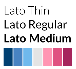
The construction of the design system for this visualisation involved creating the visual design language, including the components of colour, typography, size and spacing, along with a UI pattern. As we do not have much imagery, the guidelines for illustrations and icons have not been precisely defined (yet). Colours were selected and their contrast checked using the WebAIM online tool to accommodate users with visual impairments. Furthermore, care was taken to avoid the colours red and green for juxtapositions since about 1 in 12 men and 1 in 200 women suffer from red-green visual impairment[1]. Instead, magenta and imperial blue were chosen as contrasting colours to represent negative and positive sentiments, respectively. The shade of blue chosen is also the same as in the ImpVis logo to comply with the branding of the overall website. The sans serif font Lato was chosen as typeface due to its good readability at small sizes and large variety of styles (i.e. thin, regular, medium etc.).
On the topic page the desktop was divided into a side and main column following the rule of thirds. As per request of the staff partner the user should see the key data at a glance which is achieved by placing the primary chart of a topic in the main column and secondary charts in the scrollable side column on the left. For more information, users can expand each infographic by clicking on the icon in the top right corner of each representation. This way, the visualisation does not become cluttered and shows only the necessary information required to get a grasp of the topic. The zoom controls on the right are for magnifying the bubbles in this section to read what publication each one represents without losing the visual element of its size corresponding to the amount of times the paper has been cited. For the home page the background was blurred and the elements the user is meant to interact with are placed in the middle, to direct their attention to it. On both pages a help button was added to the top right or bottom right corner, as this is the location users intuitively look to find more guidance in.
The visualisation was made even more intuitive by using symbols whose function is known to the users. For example, when a user sees a magnifying glass icon in a bar, they know that this is a search bar where they can look up terms.
Throughout the design process, decisions were discussed within our project group and we continually suggested potential enhancements or challenged choices that had previously been made.
Next steps:
- add scroll bar to the side column
- make bubbles float and maybe even movable
- add expanded views for individual graphs
- embed publications (or their abstracts)
- design more pages displaying different types of charts
- make the design responsive
Click here and take a look at our first prototype!
Interaction Design
The interaction was designed to make the visualisation as intuitive as possible, with no need to explain the function of each tool. The homepage presents a search bar, which the user can use to input keywords if they have a specific theme they want to explore. The 'surprise me' button has been implemented for users that don't have a precise ideas and just want to explore the visualisation: it takes them randomly to a set of selected keywords. Using each of the two elements will take the user to the 'analysis page', where they will be able to subsequently navigate back to the homepage, to related topics, explore further some analyses by clicking on them.
All the implemented interactive options are intuitive, the user just clicks on the element and a new window, pop up or zoom will appear. e.g. the home button has a house shape: all straightforward.
Design elements
- Question marks pop ups: can click on question marks on the home page: pop up with text explaining general function of interaction + different options. Justification: clear help function, intuitive. User can choose to click on it: if knows how to use the visualisation, no impact on the design, content not overwhelming.
- Search bars and enter button: for learner's input of keywords/filters. Explicit function, similar to google
- Buttons for navigation within platform: return to home page... function indicated on button
- Links enabling user to click on words to either go to another page with this keyword inputted directly in the search bar, or click on paper title and go on page with more information about the paper: intuitive.
- zoom buttons indicated by + and -: function is intuitive. Allow the user to make the titles of some bubbles, that might be too small to read, more readable
We originally decided on putting no indication and let the user find its way through the interaction, but following the feedback process, realised we might want to implement a question mark pop up that provides more information on each page if clicked on.
Progress and Future Work
- Is the design finalised?
- The design is not finalised. We have done the prototype of the project and the main frame.
- Which pages have been uploaded to website?
- Pages uploaded are: The main page and template pages for positive/neutral/negative terms.
- Any ideas for future improvements.
- Main ideas for future improvements are coding the website and making it functional and using a broader data set to get more accurate results.
Links
- Link to GitHub repository for code in development:
- Link to visualisation on ImpVis website (when uploaded):
- ImpVis website (in progress): https://impvis.co.uk/code/projects/7
- Link to Collection on ImpVis website (when created):
- Link to Figma Prototype: https://www.figma.com/proto/SVziYGbNHYZQQue8e1PWQ6/ImpVis?node-id=312%3A3&scaling=min-zoom&page-id=0%3A1&starting-point-node-id=312%3A3
- Project's Miro Board: https://miro.com/app/board/o9J_lpvA2FQ=/
- Staff-partner's Research Paper: https://doi.org/10.1007/s10805-021-09422-4


