Difference between revisions of "X-ray diffraction"
| Line 99: | Line 99: | ||
* To further deepen the idea of how a Fourier transform works, this visualization will be shown for multiple functions. If only one function was shown, the user might not get the full picture. For instance, if we only showed the user a Gaussian and its FT they might think that all Fourier transforms do is shrink and pull without changing the functional form – which is clearly not true. In addition to the Gaussian, there are also visualizations for a top hat function a cos function, and a Dirac delta. To aid with the more mathematical understanding of Fourier, there will be notes (including formulae) on the side. As you scroll through the notes, the relevant visualization will be shown. This helps a clear connection between the visual information and the mathematical information. One aspect we were concerned about was that users would only ‘play’ with the visualization rather than use it as a learning tool. To stop this, the visualization you are on won’t change unless you scroll over the written notes on the left. This forces the user to interact with the mathematical content. | * To further deepen the idea of how a Fourier transform works, this visualization will be shown for multiple functions. If only one function was shown, the user might not get the full picture. For instance, if we only showed the user a Gaussian and its FT they might think that all Fourier transforms do is shrink and pull without changing the functional form – which is clearly not true. In addition to the Gaussian, there are also visualizations for a top hat function a cos function, and a Dirac delta. To aid with the more mathematical understanding of Fourier, there will be notes (including formulae) on the side. As you scroll through the notes, the relevant visualization will be shown. This helps a clear connection between the visual information and the mathematical information. One aspect we were concerned about was that users would only ‘play’ with the visualization rather than use it as a learning tool. To stop this, the visualization you are on won’t change unless you scroll over the written notes on the left. This forces the user to interact with the mathematical content. | ||
* | * After introducing students to 1-D Fourier transform, the visualisation aims to build intuition of how crystal structure correlate to diffraction patterns. By showing a two-dimensional crystal lattice next to the resulting X-ray diffraction pattern, the student can easily compare the two screens and notice properties such as symmetries. | ||
* In order to more easily introduce reciprocal space, the lesson begins with a two-dimensional visualisation. This visualisation is intended to first describe a normal lattice and what it represents, in which the student can then see the corresponding reciprocal lattice, and by interacting with the normal lattice, the student will be able to identify key features of reciprocal space, namely its orthogonality to normal space, and it's reciprocal nature. It is intended to have the specific mathematics described in the left panel. Having now a good understanding in two-dimensions, the student can quickly start to understand the concept in three-dimensions. Although the student may have a good understanding of reciprocal space now, a three-dimensional visual is still much more cluttered. So, the visualisation was limited to only one cell and also introduced each element one by one. As shown on the Miro board, by constructing the visualisation this way, you can highlight the key features, like bringing to attention how a reciprocal lattice vector is at a right-angle to a real lattice plane. A final feature left to bring to light was the lattice's lack of centre, by giving the student to sliders to enlarge and rotate the normal lattice, and see what changes. | * In order to more easily introduce reciprocal space, the lesson begins with a two-dimensional visualisation. This visualisation is intended to first describe a normal lattice and what it represents, in which the student can then see the corresponding reciprocal lattice, and by interacting with the normal lattice, the student will be able to identify key features of reciprocal space, namely its orthogonality to normal space, and it's reciprocal nature. It is intended to have the specific mathematics described in the left panel. Having now a good understanding in two-dimensions, the student can quickly start to understand the concept in three-dimensions. Although the student may have a good understanding of reciprocal space now, a three-dimensional visual is still much more cluttered. So, the visualisation was limited to only one cell and also introduced each element one by one. As shown on the Miro board, by constructing the visualisation this way, you can highlight the key features, like bringing to attention how a reciprocal lattice vector is at a right-angle to a real lattice plane. A final feature left to bring to light was the lattice's lack of centre, by giving the student to sliders to enlarge and rotate the normal lattice, and see what changes. | ||
===Graphical Design=== | ===Graphical Design=== | ||
Revision as of 13:49, 8 December 2021
This is a template which you can use to help get you started on the wiki submission. It is just intended as a guide and you may modify the structure to suit your project.
Contributors
- Jacob Edginton - Department of Physics (student partner) - Term 1 2021
- Hans Lee - Department of Physics (student partner) - Term 1 2021
- Benjamin Smith - Department of Mathematics (student partner) - Term 1 2021
- Ziang Yan - Department of Mathematics (student partner) - Term 1 2021
- Jonathan Rackham, Department of Materials. Staff partner from October 2021.
Aims & Learning Outcomes
- Explain the motivation for your visualisation.
- Introduce the subject of your visualisation.
- Which module and year is it intended for and which setting (lecture or self study)?
This visualisation would be used as teaching tools in MATE50005 (Materials Characterisation, second year undergraduate) lectures as well as self-study tools in lab sessions. It will also be useful in the MATE70001 module (MSc Characterisation course).
After using this visualisation, students will be able to:
- qualitatively describe the relationship between direct and reciprocal lattices.
- discuss the features of reciprocal space and how they relate to a crystal’s structure.
- relate the motion of a diffractometer to that of the scattering vector through reciprocal space.
- evaluate the effect of experimental conditions on the diffraction patterns obtained.
Design Overview
The design was split up into four main parts: Fourier transforms, diffraction patterns, reciprocal space, and the Ewald's sphere. The visualisations are shown graphically on the right.
Fourier Transforms
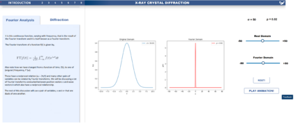
Fourier transform are the key mathematical framework for all of crystal X-ray diffraction theory. The Fourier visualisation shows two graphs: a function in the real domain, and the Fourier Transform of that function in the conjugate domain. The user is given control over an adjustable parameter in the function, for instance, for the Gaussian example, the user can control the width. If the play animation button is pressed, this parameter will be continuously varied such that the two graphs move in real time. The user is also given a rest button to return to the original conditions. A feedback button is available so that the design can be further improved. It can be seen that on the left side of the visualisation, there is written text and mathematical formulae that give an explanation of what the user is seeing graphically.
The main goal of this visualisation was to give the user an intuitive understanding of Fourier transformations, without having to rely on solely mathematics. The functions most relevant to the materials course were created in the visualisation: the Gaussian, the Top Hat function, a sinusoid, the Dirac delta, and the Dirac comb [more images to be added].
Diffraction Patterns
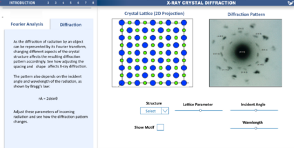
This section of the visualisation aimed to connect the geometry of the lattice of a crystal to the expected diffraction pattern if X-rays were incident. The user can control the type of lattice: rock salt, titanium, alumina, etc. Each type of lattice will have a different diffraction pattern based on its geometry. The user can choose to show only the basic structure of lattice points, or the full structure showing the molecular motif.
The user also has control three other parameters: the wavelength and incident angle of the X-rays, and a lattice parameter corresponding to how spaced out the lattice is.
Reciprocal Space
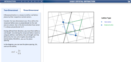
One of the main theoretical techniques of X-ray crystal diffraction is to work in the reciprocal space - the conjugate domain and Fourier transform of real space. The real and reciprocal lattices are overlaid onto each other. A unit cell of the real space is shown in blue, and a unit cell of the reciprocal space is shown in green. The user can click the toggle points (labelled x and y) and move around the real lattice unit cell, then see what the subsequent reciprocal lattice unit cell looks like.
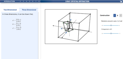
This concept was extended into 3D. A full 3D unit cell can be seen in both real and reciprocal space. As before, by clicking and moving toggle points, the user can change the size and shape of the real space unit cell, then see the resulting reciprocal space lattice cell. Moreover, the user has the ability to see how many vectors are shown: by adding or substracting on the constructions button, the number of vectors is varied. The student will also have the ability to change perspective in both visualisations. Finally, the user has the ability to rotate and enlarge the unit cell.
Ewald's Sphere
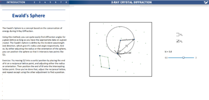
The Ewald's sphere is a construction in reciprocal space used to see if the elastic scattering condition of diffraction is met. The sphere is extended from an arbitrary lattice point, and has a radius equal to the magnitude of the wave vector (the reciprocal of wavelength). If two scattering vectors, ki and kf can connect two lattice points that intersect the sphere, then a diffraction will occur. The user has the option to toggle two different spheres, and can alter the magnitude and direction of ki independently.
<iframe src="https://www.geogebra.org/geometry/jurwjjpg?embed" width="800" height="600" allowfullscreen style="border: 1px solid #e4e4e4;border-radius: 4px;" frameborder="0"></iframe>
Links:
https://www.geogebra.org/geometry/ky9yvnft
https://www.geogebra.org/3d/jwwfpfjh
https://www.geogebra.org/geometry/hdzuccwh
https://www.desmos.com/calculator/bcgiljqres
https://miro.com/app/board/o9J_lpv6cb8=/ (Miro board)
Design Justification
Assessment Criteria
Education Design
- Target audience and their prior knowledge is clearly identified. This information is applied to decide what the learning outcomes should be.
- Key concepts identified and broken down into several discrete and easily achievable points.
Graphical Design
- The design is such that the visualization is clear and easily understood; the layout isn't cluttered.
- The choice of font, as well as size and placement of text, makes the information easy to comprehend.
- The color palette is appropriate and well justified, making it easy to see all text/design elements
Interaction Design
- The learner should know intuitively what the objectives are of the visualization.
- The user should be able to intuitively understand the function of each interactive element in the visualization.
- There should be immediate visual feedback when a learner interacts with the visualization.
Education Design
What Methods were considered to convey concepts? Design progression, key choices with justifications. How has feedback been incorporated.
- To further deepen the idea of how a Fourier transform works, this visualization will be shown for multiple functions. If only one function was shown, the user might not get the full picture. For instance, if we only showed the user a Gaussian and its FT they might think that all Fourier transforms do is shrink and pull without changing the functional form – which is clearly not true. In addition to the Gaussian, there are also visualizations for a top hat function a cos function, and a Dirac delta. To aid with the more mathematical understanding of Fourier, there will be notes (including formulae) on the side. As you scroll through the notes, the relevant visualization will be shown. This helps a clear connection between the visual information and the mathematical information. One aspect we were concerned about was that users would only ‘play’ with the visualization rather than use it as a learning tool. To stop this, the visualization you are on won’t change unless you scroll over the written notes on the left. This forces the user to interact with the mathematical content.
- After introducing students to 1-D Fourier transform, the visualisation aims to build intuition of how crystal structure correlate to diffraction patterns. By showing a two-dimensional crystal lattice next to the resulting X-ray diffraction pattern, the student can easily compare the two screens and notice properties such as symmetries.
- In order to more easily introduce reciprocal space, the lesson begins with a two-dimensional visualisation. This visualisation is intended to first describe a normal lattice and what it represents, in which the student can then see the corresponding reciprocal lattice, and by interacting with the normal lattice, the student will be able to identify key features of reciprocal space, namely its orthogonality to normal space, and it's reciprocal nature. It is intended to have the specific mathematics described in the left panel. Having now a good understanding in two-dimensions, the student can quickly start to understand the concept in three-dimensions. Although the student may have a good understanding of reciprocal space now, a three-dimensional visual is still much more cluttered. So, the visualisation was limited to only one cell and also introduced each element one by one. As shown on the Miro board, by constructing the visualisation this way, you can highlight the key features, like bringing to attention how a reciprocal lattice vector is at a right-angle to a real lattice plane. A final feature left to bring to light was the lattice's lack of centre, by giving the student to sliders to enlarge and rotate the normal lattice, and see what changes.
Graphical Design
- How were accessibility issues considered?
- How was space used effectively?
- Design progression, key choices with justifications.
- How has feedback been incorporated.
- How is the design intuitive?
- A range of shades of blue were implemented. This formed a set of colours that was not visually heavy but was still aesthetically pleasing. Note that the conjugate domain Fourier graph was shown in red. This was gone to give it contrast to the real domain plot: highlighting how the two are different. The text was shown on a light blue pattern with dark text (black).
- Diffraction Patterns...
- For both the reciprocal visualisations, different colours where used to distinguish between real and reciprocal lattices. And in two dimensions, in order to highlight the chosen centre and axes, the grid was dotted, keeping both axes filled.
Interaction Design
- Choice of interactive element(s) that fit in organically with the visualisation [inspiration of choice might be from lecture/in-class activity or other sources] - Sliders/Buttons/Cursor (hover/click).
- Keeping accessibility of interactive elements in mind during design phase.
- Design progression, key choices with justifications.
- How has feedback been incorporated.
- The Fourier analysis visualization seeks to be interactive via two sliders. They let you control an adjustable parameter in the function we are examining. For instance, in a Gaussian it lets you control sigma and ‘conjugate sigma’ (rho). This gives the user an interactive input, and helps people make the connection between the two parameters (if one is altered so is the other). To add to this, there is an animate button. When pressed, the range of values of a parameter will be swept over. Whilst this is less interactive than manually adjusting the slider, it gives the user a strong overview how a function and its Fourier Transform will change for many different values of a parameter. ensure the user can return to their original state, a reset button will be implemented. This will set the values of the two parameters back to their starting values. In addition, there will be a feedback button. This allows users to submit input and suggest how the visualization might be improved.
- Diffraction pattern...
- For the reciprocal visualisation, any interactive element was highlighted in blue. In order to not clutter the visualisation, any interactive element that could be interacted with indirectly, was left to sliders and toggles outside the visualisation window. To keep the education design element in mind, some interactive elements are only intended to appear after certain events such as reading past a certain point in the left panel or finishing the construction of the three-dimensional visualisation. A feature intended for the student to be able to use is to be able to change their view of the visualisation, and whilst the draft doesn't bring light to this, it can be done by including some extra buttons next to the visual windows, one with a cursor, meant to toggle the users ability to interact with the blue points, and the other with a scroll icon, meant to toggle the students ability to change their perspective.
Progress and Future Work
- Is the design finalised? - [draft version]
- All the Geogebra and Desmos visualisations used in the design have been linked on this page.
- In the software the visualisations were created in, snapping to points (i.e. lattice points) was not possible. Adding this would make the Ewald's sphere visualisation easier to understand.
Links
- Link to GitHub repository for code in development:
- Link to visualisation on ImpVis website (when uploaded):
- Link to Collection on ImpVis website (when created):
- Any other links to resources (Miro boards / notes pages / Google Docs etc):
