Difference between revisions of "Sidebar section"
| (8 intermediate revisions by the same user not shown) | |||
| Line 12: | Line 12: | ||
Description: Used to set the colour of the sidebar section. Can choose from the following: | Description: Used to set the colour of the sidebar section. Can choose from the following: | ||
< | <syntaxhighlight lang="JavaScript" line> | ||
Theme.DeepBlue = new Theme('#0b3053') | Theme.DeepBlue = new Theme('#0b3053') | ||
Theme.Blue = new Theme('#008bd2') | Theme.Blue = new Theme('#008bd2') | ||
| Line 22: | Line 22: | ||
Theme.Yellow = new Theme('#fcd916') | Theme.Yellow = new Theme('#fcd916') | ||
Theme.Gold = new Theme('#f6b00f') | Theme.Gold = new Theme('#f6b00f') | ||
</ | </syntaxhighlight> | ||
Latest revision as of 16:26, 12 July 2022
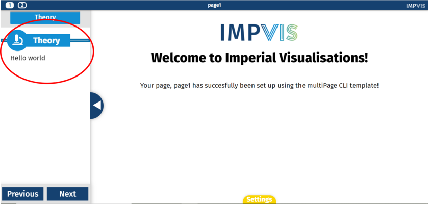
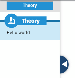
The iv-sidebar-sectioncomponent creates a content section within the pane. It is placed inside the pane component (and inside the sidebar content component, if there is one). You can add multiple sections.

Technical Information
Props
theme
Type: String
Default: 'Blue'
Description: Used to set the colour of the sidebar section. Can choose from the following:
Theme.DeepBlue = new Theme('#0b3053')
Theme.Blue = new Theme('#008bd2')
Theme.Turqouise = new Theme('#11b1a2')
Theme.Lime = new Theme('#a8cc6a')
Theme.Purple = new Theme('#62296b')
Theme.Red = new Theme('#cf103f')
Theme.Orange = new Theme('#ef7814')
Theme.Yellow = new Theme('#fcd916')
Theme.Gold = new Theme('#f6b00f')
title
Type: String
Required: true
Description: Title of the sidebar section
icon
Type: String
Default: 'star'
Description: Can specify the icon displayed next to the sidebar section title. Can choose any icon from this website.
highlight
Type: Boolean
Default: false
Description: If true, highlights the sidebar section.
Design Choice
The sidebar section title is in a boxed shape to make it stand out against any text. Icons can be specified to add a graphical visual element.
