Difference between revisions of "Slider"
(→Props) |
|||
| (2 intermediate revisions by one other user not shown) | |||
| Line 173: | Line 173: | ||
Default: true | Default: true | ||
Description: used to create a reset button for the slider | |||
| Line 192: | Line 194: | ||
Description: sets the delay (in ms) between incrementations when using the Play button. | Description: sets the delay (in ms) between incrementations when using the Play button. | ||
<div class="res-img"> | <div class="res-img"> | ||
[[File:Slider 1.png|880x880px]] | [[File:Slider 1.png|880x880px]] | ||
| Line 217: | Line 218: | ||
Description: Set the slider value to 0 when click on the reset button | Description: Set the slider value to 0 when click on the reset button | ||
Name: sliderChangedbyPlay | |||
Triggered: Mousedown on Play button | |||
Description: Emit slider value whilst slider increments after pressing Play | |||
===Design Choice=== | ===Design Choice=== | ||
The slider has two themes that users can choose from--green and imperial blue, both contrust the white background. The thumb was made to be round so that it can display numbers better. | The slider has two themes that users can choose from--green and imperial blue, both contrust the white background. The thumb was made to be round so that it can display numbers better. | ||
[[Category:Slider Components]] | |||
[[Category: | |||
Latest revision as of 15:00, 30 September 2021
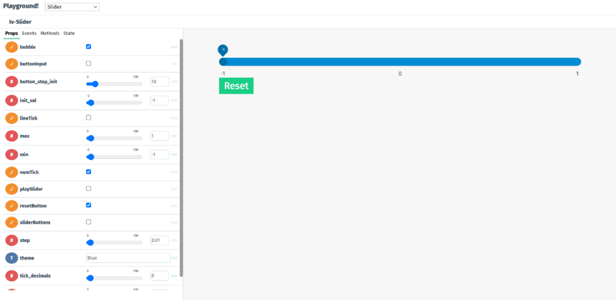
The iv-slider component appears as a range slider with costumised maximum and minimum values and number of ticks.
Techical/coding information
The Slider Component contains 4 sub-components, which are listed below:
It also has 15 props:
Props
Name: bubble
Type: Boolean
Default: true
Description: Used to display slider value as a bubble above the slider thumb, which follows the thumb
Name: sliderButtons
Type: Boolean
Default: flase
Description: Used to display buttons to increase or decrease the slider value by a fixed amount
Name: sliderButtons
Type: Boolean
Default: flase
Description: Used to display buttons to increase or decrease the slider value by a fixed amount
Name: buttonInput
Type: Boolean
Default: flase
Description: Used to display input to vary the sliderButton increase or decrease amount, applied to both equally
Name: lineTick
Type: Boolean
Default: flase
Description: Used to display line slider ticks at each step
Name: numTick
Type: Boolean
Default: true
Description: Used to display value slider ticks at each step
Name: numTick
Type: Boolean
Default: true
Description: Used to display value slider ticks at each step
Name: playSlider
Type: Boolean
Default: false
Description: Differnet mode of slider where slider buttons move to and from the previous and next frame
Name: min
Type: Number
Default: -1
Description: Used to set the minimum value of the slider
Name: max
Type: Number
Default: 1
Description: Used to set the maximum value of the slider
Name: step
Type: Number
Default: 0.01
Description: used to set the step size in the range of motion of the slider
Name: init_val
Type: Number
Default: -1
Description: used to set initial value of the slider
Name: init_val
Type: Number
Default: -1
Description: used to set initial value of the slider
Name: button_step_init
Type: Number
Default: 10
Description: used to set the value of the sliderButtons
Name: tick_decimals
Type: Number
Default: 0
Description: used to set the number of decimal places for the numTick
Name: tick_step
Type: Number
Default: 1
Description: used to set the step size between each numTick
Name: theme
Type: String
Default: "Blue"
Description: used to set the theme color of the slider (can choose from Blue and Green)
Name: resetButton
Type: Boolean
Default: true
Description: used to create a reset button for the slider
Name: playButton
Type: Boolean
Default: false
Description: used to create a Play/Pause button for the slider to increment continuously upon click.
Name: time_step
Type: Number
Default: 100
Description: sets the delay (in ms) between incrementations when using the Play button.
Events
Name: sliderChangedbyDragging
Triggered: Mousedown and mouseover
Description: Emit slider value when dragging the thumb
Name: sliderChangedbyClick
Triggered: Mousedown
Description: Emit slider value when changing the thumb position by clicking
Name: click
Triggered: Mousedown
Description: Set the slider value to 0 when click on the reset button
Name: sliderChangedbyPlay
Triggered: Mousedown on Play button
Description: Emit slider value whilst slider increments after pressing Play
Design Choice
The slider has two themes that users can choose from--green and imperial blue, both contrust the white background. The thumb was made to be round so that it can display numbers better.

