Difference between revisions of "The ImpVis Visual Identity - Ethos"
Mark Thomas (talk | contribs) |
|||
| (7 intermediate revisions by 2 users not shown) | |||
| Line 1: | Line 1: | ||
At ImpVis, we have several design principles and goals that help guide how visualisations look and feel. As developers, you should always keep these principles in mind; as long as you adhere to our ethos, your specific styling can vary however you want. | At ImpVis, we have several design principles and goals that help guide how visualisations look and feel. As developers, you should always keep these principles in mind; as long as you adhere to our ethos, your specific styling can vary however you want. | ||
* '''Playful'''We want to encourage people to get involved in our visualisations. The colours, layout, and animation should be enticing and invite creativity and curiosity. | * '''Playful''' We want to encourage people to get involved in our visualisations. The colours, layout, and animation should be enticing and invite creativity and curiosity. | ||
* '''Intuitive | * '''Intuitive''' Although every visualisation should be accompanied by guidance, any person should immediately be able to interact with a visualisation. Buttons to be pressed and sliders to be dragged should seem to “pop” out the screen. | ||
* '''Light | * '''Light''' In terms of tone, any ImpVis visualisation should never feel dark, heavy, or too artificial. Instead, it should feel light, fun, and natural. | ||
* '''Clean and Concise''' As we are dealing with difficult scientific concepts, one of our main priorities is not to overwhelm the user with complexity. As such, each visualisation should look clean and organised (but not disparate). | * '''Clean and Concise''' As we are dealing with difficult scientific concepts, one of our main priorities is not to overwhelm the user with complexity. As such, each visualisation should look clean and organised (but not disparate). | ||
* '''Part of a journey | * '''Part of a journey''' Every visualisation should be taking the user on a journey. The page's overall design should reflect this; the user’s attention should be drawn to the start of the visualisation journey and move slowly towards the journey’s end. | ||
== The ImpVis Visual Identity - Colour Schemes == | |||
When developing the colour scheme for any individual visualisation, special attention should be paid to keeping the visualisations colour-blind friendly. In practice, this means making fair use of monochromatic schemes when possible and using online tools to ensure that, when contrasting colours are chosen (e.g., in plots), they are visibly contrasting to everyone. | |||
Some useful links are: http://colorbrewer2.org/#type=sequential&scheme=BuGn&n=3 and https://venngage.com/blog/color-blind-friendly-palette/ | |||
Below is our ImpVis branded colour scheme, with associated hex codes. The template colours are based on this colour scheme. Developers have freedom in picking colours for their components within this range.[[File:Colour scheme.1bd4abb1.png|center|frameless|600x600px| | |||
The ImpVis colour scheme]][[File:Sliderblock.ca8ef98e.png|thumb|Slider colours example]]Within components such as the slider, we advise using different shades and tints of a single colour to create a distinction between subsections within a component and combining with the help of black and white text depending on the given background colour. The figure shown to the right highlights this. | |||
The range of shade and tints shown of the figure below is achieved using two equations: | |||
* New_rgb = old_r *(1 - shade_Factor), old_g *(1 - shade_Factor), old_b *(1 - shade_Factor) | |||
* New_rgb = old_r + (255 - old_r )*tint_Factor, old_g + (255 - old_g )*tint_Factor, old_b + (255 - old_b)*tint_Factor | |||
The first equation produced darker shades, and the second equation made lighter tints, with the shade and tint factors in each varied to increase change. These colours and their shades are produced once at the page load in '''colorStore.js''' vue bus and may be accessed by using <code>import colorStore from "@/buses/colorStore"</code> the shades of a given colour are then selected using color: <code>colorStore.color_full_list["myColour"]</code>. Note that the selectable colours are accessed using the following keys:[[File:Sliderblock colours.f57fbdfb.png|thumb|Range of shades of a single colour]] | |||
* "navy": [14,64,111], | |||
* "blue": [0,139,210], | |||
* "teal": [17,177,162], | |||
* "green": [168,204,106], | |||
* "purple": [98,41,107], | |||
* "berry": [207,16,63], | |||
* "orange": [239,120,20], | |||
* "tangerine": [246,176,15], | |||
*"yellow": [252,217,22] | |||
Where the RGB has replaced the hex codes for each colour for the colour. So for example, if I wanted to access the shades for #0E406F (the first colour), then I would use: <code>color: colorStore.color_full_list[“navy”]</code> within the data of my component and then to access a specific shade I use <code>this.color.shade_500</code> (for the unchanged input navy colour), <code>this.color.shade_900</code>(for the darkest shade), <code>this.color.shade_100</code>(for the lightest shade). | |||
== Text == | |||
Imperial College London’s executive typeface “Meta normal” is used as the font on all visualisations. For more information on this, see: https://www.imperial.ac.uk/brand-style-guide/visual-identity/font/ . | |||
[[Category:Graphic Design]] | |||
Latest revision as of 12:59, 28 September 2021
At ImpVis, we have several design principles and goals that help guide how visualisations look and feel. As developers, you should always keep these principles in mind; as long as you adhere to our ethos, your specific styling can vary however you want.
- Playful We want to encourage people to get involved in our visualisations. The colours, layout, and animation should be enticing and invite creativity and curiosity.
- Intuitive Although every visualisation should be accompanied by guidance, any person should immediately be able to interact with a visualisation. Buttons to be pressed and sliders to be dragged should seem to “pop” out the screen.
- Light In terms of tone, any ImpVis visualisation should never feel dark, heavy, or too artificial. Instead, it should feel light, fun, and natural.
- Clean and Concise As we are dealing with difficult scientific concepts, one of our main priorities is not to overwhelm the user with complexity. As such, each visualisation should look clean and organised (but not disparate).
- Part of a journey Every visualisation should be taking the user on a journey. The page's overall design should reflect this; the user’s attention should be drawn to the start of the visualisation journey and move slowly towards the journey’s end.
The ImpVis Visual Identity - Colour Schemes
When developing the colour scheme for any individual visualisation, special attention should be paid to keeping the visualisations colour-blind friendly. In practice, this means making fair use of monochromatic schemes when possible and using online tools to ensure that, when contrasting colours are chosen (e.g., in plots), they are visibly contrasting to everyone.
Some useful links are: http://colorbrewer2.org/#type=sequential&scheme=BuGn&n=3 and https://venngage.com/blog/color-blind-friendly-palette/
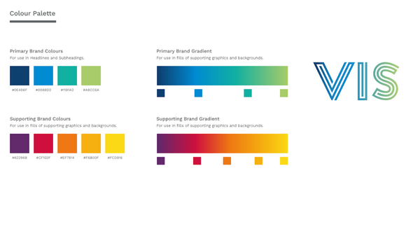
Below is our ImpVis branded colour scheme, with associated hex codes. The template colours are based on this colour scheme. Developers have freedom in picking colours for their components within this range.
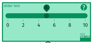
Within components such as the slider, we advise using different shades and tints of a single colour to create a distinction between subsections within a component and combining with the help of black and white text depending on the given background colour. The figure shown to the right highlights this.
The range of shade and tints shown of the figure below is achieved using two equations:
- New_rgb = old_r *(1 - shade_Factor), old_g *(1 - shade_Factor), old_b *(1 - shade_Factor)
- New_rgb = old_r + (255 - old_r )*tint_Factor, old_g + (255 - old_g )*tint_Factor, old_b + (255 - old_b)*tint_Factor
The first equation produced darker shades, and the second equation made lighter tints, with the shade and tint factors in each varied to increase change. These colours and their shades are produced once at the page load in colorStore.js vue bus and may be accessed by using import colorStore from "@/buses/colorStore" the shades of a given colour are then selected using color: colorStore.color_full_list["myColour"]. Note that the selectable colours are accessed using the following keys:
- "navy": [14,64,111],
- "blue": [0,139,210],
- "teal": [17,177,162],
- "green": [168,204,106],
- "purple": [98,41,107],
- "berry": [207,16,63],
- "orange": [239,120,20],
- "tangerine": [246,176,15],
- "yellow": [252,217,22]
Where the RGB has replaced the hex codes for each colour for the colour. So for example, if I wanted to access the shades for #0E406F (the first colour), then I would use: color: colorStore.color_full_list[“navy”] within the data of my component and then to access a specific shade I use this.color.shade_500 (for the unchanged input navy colour), this.color.shade_900(for the darkest shade), this.color.shade_100(for the lightest shade).
Text
Imperial College London’s executive typeface “Meta normal” is used as the font on all visualisations. For more information on this, see: https://www.imperial.ac.uk/brand-style-guide/visual-identity/font/ .


