Difference between revisions of "Guidance system and z-indexing"
(Created page with "== Guidance system review == So how does it work? Or at least how is it intended to work? The user interacts in two different ways, firstly accessing the information on indivi...") |
|||
| (One intermediate revision by the same user not shown) | |||
| Line 1: | Line 1: | ||
== Guidance system | The guidance system intends to aid the visualization user in understanding how to get as much as possible out of the experience. It is not to be used to explain scientific concepts. | ||
== Guidance system overview == | |||
How is the guidance system intended to work? The user interacts in two different ways, firstly accessing the information on individual items using buttons stored within the iv-visualization component. This includes most of the screen, excluding the title bar. When clicked, a modal (i.e. a small pop-up window) appears showing help on specifically only that component. The second is a more general system used for a user who quickly wants to understand how to use all the visualization items. This allows the user to pick a branch to go down intended to show several screens of information regarding a common theme, such as graphs or sliders. There is also the option to see all the modal screens in one go. | |||
== Z-indexing == | == Z-indexing == | ||
When a modal is shown, an HTML element may be highlighted by showing it above the greyed out modal background. This is currently achieved by changing the z-index of the selected HTML element and then returning to z-index=0 after the window is close, or a new screen is selected. Z-index is tricky in that the parent of the component determines the ceiling of the child component regardless of that child's z-index. The top element's z index determines the z index of its children. However, the z-index of any of the children can be set. See here: | When a modal is shown, an HTML element may be highlighted by showing it above the greyed out modal background. This is currently achieved by changing the z-index of the selected HTML element and then returning to z-index=0 after the window is close, or a new screen is selected. Z-index is tricky in that the parent of the component determines the ceiling of the child component regardless of that child's z-index. The top element's z index determines the z index of its children. However, the z-index of any of the children can be set. See here: | ||
Examples: | Examples: | ||
Parent 1 : 0 | Parent 1: 0 | ||
Child a : 0 | Child a: 0 | ||
Child | Child b: 900 | ||
Parent 2 : 0 | Parent 2: 0 | ||
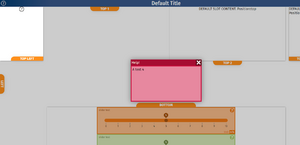
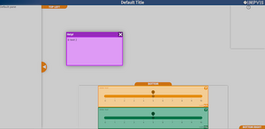
Child q: 500[[File:Z index display.fdbeb982.png|thumb|Z-index display]]Even though child b is from a parent at the original source with the same z-index as the sibling because it has a child with a set z-index above it, then the z-index of child a is compared to child q. Hence, child b is never above child q. In the image above, the z-index is used to highlight a specific component associated with the guidance help screen, which is the top left togglable hotspot. This is achieved by having the guidance system z-index set to 0 and the iv-visualisation component z-index set to 0. None of the children of these two components has a z-index set, which itself has children. This means that its okay to have an individual button, which is a child of iv-visualisation with a z-index set to say 1. Still, the button itself should not have children with a set z-index. As outlined earlier, these children will always have their z-index relative to the parent button and not to some absolute z-index. In the image's case, the guidanceModal component raises the highlighted component to be at a z-index higher than the grey background but underneath the actual modal. When the modal screen is closed or changed, the highlighted component is returned to the '''z-index: auto''' state (see image on right). | |||
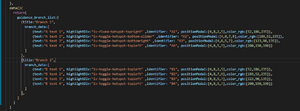
'''Guidance system review'''[[File:Guidance data structure.ecc03472.png|thumb|Guidance data structure]]The guidance data structure is constructed currently as shown to the right. | '''Guidance system review'''[[File:Guidance data structure.ecc03472.png|thumb|Guidance data structure]]The guidance data structure is constructed currently as shown to the right. | ||
| Line 25: | Line 28: | ||
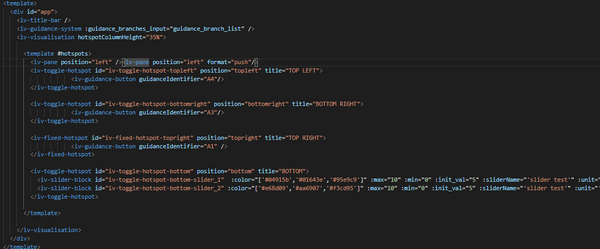
Each individual modal help screen requires the following: text, highlightDiv, identifier, position, and colour_rgb. Text is what is shown inside of the modal body. HighlightDiv is the HTML element, which is highlighted by the guidance (this should be sensible, i.e., don't highlight something within another hotspot if your guidance button is in another hotspot). The identifier is used to link the guidanceButton within a component to a specific item within the guidance file system, positonModal is used to position the modal on the screen <span style="color:red">[need clarification (from Dan..) on how this works]</span>. Finally, clour_rgb sets the main theming colour of the modal, which is used to calculate several shades and tints used in the modal design, i.e. [r_value,g_value,b_value]. The same model unit may be put in different branches as long as it is precisely the same i.e., doesn't have a different text for the same identifier. The current system will, however, be changed to one using markdown files for more flexibility. Associated with this data structure in App.vue, the main components in the HTML of the vue file may look like this:[[File:Component organisation.6893a9e1.png|center|thumb|600x600px|Component organisation]][[File:Component organisation display.9526d3ba.png|thumb|Modal display]]Please see the wiki of individual components for more specifics. Still, the overall notes are that the '''iv-guidance-system''' component must be included above the '''iv-visualization''' component for the guidance system to work. That guidance buttons with a valid identifier must be included to access a specific guidance modal. | Each individual modal help screen requires the following: text, highlightDiv, identifier, position, and colour_rgb. Text is what is shown inside of the modal body. HighlightDiv is the HTML element, which is highlighted by the guidance (this should be sensible, i.e., don't highlight something within another hotspot if your guidance button is in another hotspot). The identifier is used to link the guidanceButton within a component to a specific item within the guidance file system, positonModal is used to position the modal on the screen <span style="color:red">[need clarification (from Dan..) on how this works]</span>. Finally, clour_rgb sets the main theming colour of the modal, which is used to calculate several shades and tints used in the modal design, i.e. [r_value,g_value,b_value]. The same model unit may be put in different branches as long as it is precisely the same i.e., doesn't have a different text for the same identifier. The current system will, however, be changed to one using markdown files for more flexibility. Associated with this data structure in App.vue, the main components in the HTML of the vue file may look like this:[[File:Component organisation.6893a9e1.png|center|thumb|600x600px|Component organisation]][[File:Component organisation display.9526d3ba.png|thumb|Modal display]]Please see the wiki of individual components for more specifics. Still, the overall notes are that the '''iv-guidance-system''' component must be included above the '''iv-visualization''' component for the guidance system to work. That guidance buttons with a valid identifier must be included to access a specific guidance modal. | ||
[[Category: | [[Category:Old Content]] | ||
Latest revision as of 08:50, 28 September 2021
The guidance system intends to aid the visualization user in understanding how to get as much as possible out of the experience. It is not to be used to explain scientific concepts.
Guidance system overview
How is the guidance system intended to work? The user interacts in two different ways, firstly accessing the information on individual items using buttons stored within the iv-visualization component. This includes most of the screen, excluding the title bar. When clicked, a modal (i.e. a small pop-up window) appears showing help on specifically only that component. The second is a more general system used for a user who quickly wants to understand how to use all the visualization items. This allows the user to pick a branch to go down intended to show several screens of information regarding a common theme, such as graphs or sliders. There is also the option to see all the modal screens in one go.
Z-indexing
When a modal is shown, an HTML element may be highlighted by showing it above the greyed out modal background. This is currently achieved by changing the z-index of the selected HTML element and then returning to z-index=0 after the window is close, or a new screen is selected. Z-index is tricky in that the parent of the component determines the ceiling of the child component regardless of that child's z-index. The top element's z index determines the z index of its children. However, the z-index of any of the children can be set. See here:
Examples:
Parent 1: 0
Child a: 0
Child b: 900
Parent 2: 0
Child q: 500
Even though child b is from a parent at the original source with the same z-index as the sibling because it has a child with a set z-index above it, then the z-index of child a is compared to child q. Hence, child b is never above child q. In the image above, the z-index is used to highlight a specific component associated with the guidance help screen, which is the top left togglable hotspot. This is achieved by having the guidance system z-index set to 0 and the iv-visualisation component z-index set to 0. None of the children of these two components has a z-index set, which itself has children. This means that its okay to have an individual button, which is a child of iv-visualisation with a z-index set to say 1. Still, the button itself should not have children with a set z-index. As outlined earlier, these children will always have their z-index relative to the parent button and not to some absolute z-index. In the image's case, the guidanceModal component raises the highlighted component to be at a z-index higher than the grey background but underneath the actual modal. When the modal screen is closed or changed, the highlighted component is returned to the z-index: auto state (see image on right). Guidance system review
The guidance data structure is constructed currently as shown to the right.
Each individual modal help screen requires the following: text, highlightDiv, identifier, position, and colour_rgb. Text is what is shown inside of the modal body. HighlightDiv is the HTML element, which is highlighted by the guidance (this should be sensible, i.e., don't highlight something within another hotspot if your guidance button is in another hotspot). The identifier is used to link the guidanceButton within a component to a specific item within the guidance file system, positonModal is used to position the modal on the screen [need clarification (from Dan..) on how this works]. Finally, clour_rgb sets the main theming colour of the modal, which is used to calculate several shades and tints used in the modal design, i.e. [r_value,g_value,b_value]. The same model unit may be put in different branches as long as it is precisely the same i.e., doesn't have a different text for the same identifier. The current system will, however, be changed to one using markdown files for more flexibility. Associated with this data structure in App.vue, the main components in the HTML of the vue file may look like this:
Please see the wiki of individual components for more specifics. Still, the overall notes are that the iv-guidance-system component must be included above the iv-visualization component for the guidance system to work. That guidance buttons with a valid identifier must be included to access a specific guidance modal.


