Difference between revisions of "Sidebar content"
(Created page with "The <code>iv-sidebar-content</code>component creates a summary of all the sidebar sections at the top of the pane. It is placed inside the pane component. As the user scro...") |
|||
| Line 12: | Line 12: | ||
Description: If true, will show previous/next buttons at the bottom of the pane which link to previous/next pages in the visualisation | Description: If true, will show previous/next buttons at the bottom of the pane which link to previous/next pages in the visualisation | ||
===Events=== | |||
'''scrollTo''' | |||
''Description:'' | |||
''' | '''themeVars''' | ||
''Description:'' | |||
Description: | |||
==Design Choice== | ==Design Choice== | ||
The | The progress bar at the top of the pane allows the user to see how far through the pane content they are, and clearly see which section they're on by showing only the icons for the other sections. The next/previous buttons at the bottom of the pane match the styling of the pane for consistency. | ||
[[Category:Layouts]] | [[Category:Layouts]] | ||
Latest revision as of 10:45, 22 July 2021
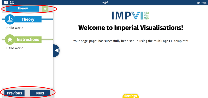
The iv-sidebar-contentcomponent creates a summary of all the sidebar sections at the top of the pane. It is placed inside the pane component. As the user scrolls down the pane, the display at the top of the pane reflects which sidebar section the user is on. Pagination can also be turned on, which shows previous/next buttons at the bottom of the pane which link to previous/next pages in the visualisation.
Technical Information
Props
showPagination
Type: Boolean
Default: true
Description: If true, will show previous/next buttons at the bottom of the pane which link to previous/next pages in the visualisation
Events
scrollTo
Description:
themeVars
Description:
Design Choice
The progress bar at the top of the pane allows the user to see how far through the pane content they are, and clearly see which section they're on by showing only the icons for the other sections. The next/previous buttons at the bottom of the pane match the styling of the pane for consistency.
